Financial Services
- Client
- LPL Financial and Capital Group
- Role
- Senior Designer
- Team
- Aquent Studios
- Sheet
- 13 / 14
- Year
- 2017 to 2023
- Disciplines
- Brand rollout · Sales enablement · Public and government relations · Data visualization · HR communications
Two of the largest names in US financial services, one goal: make complex products and dense information easy to act on.
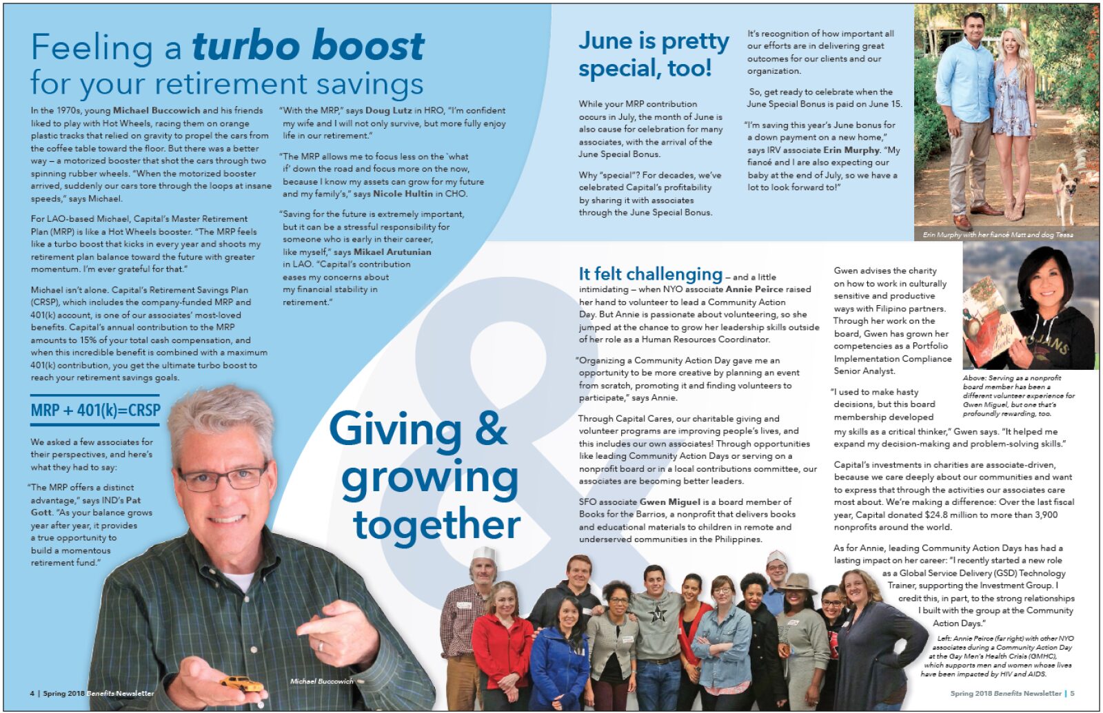
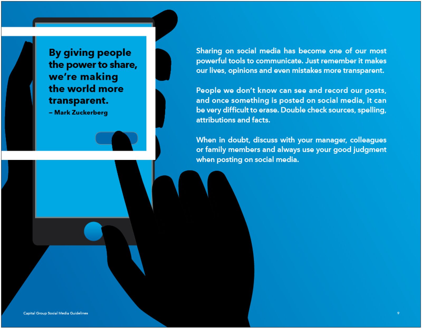
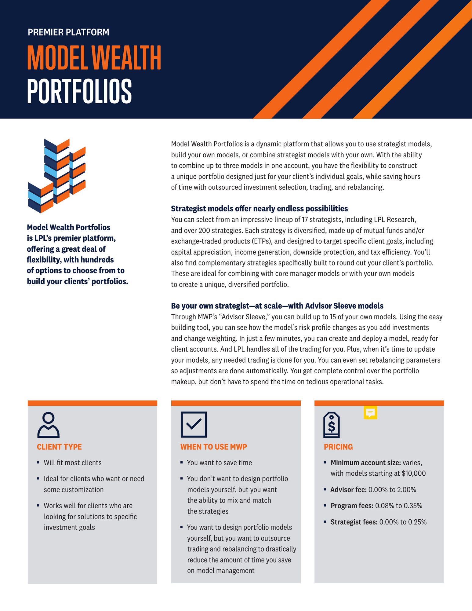
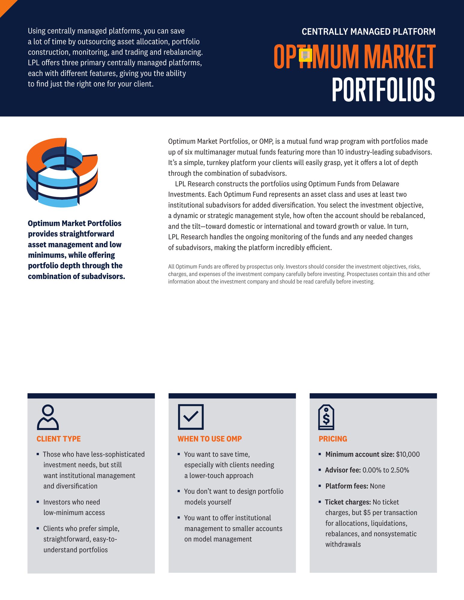
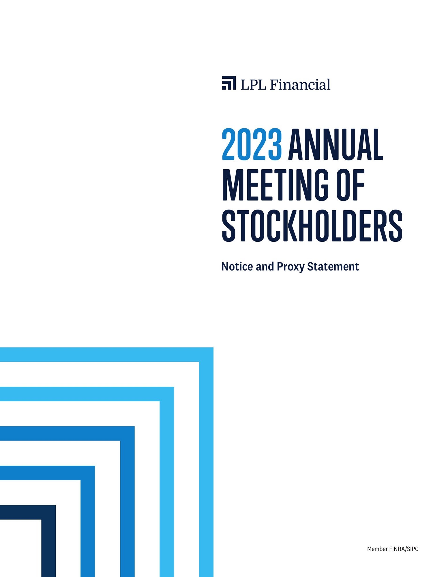
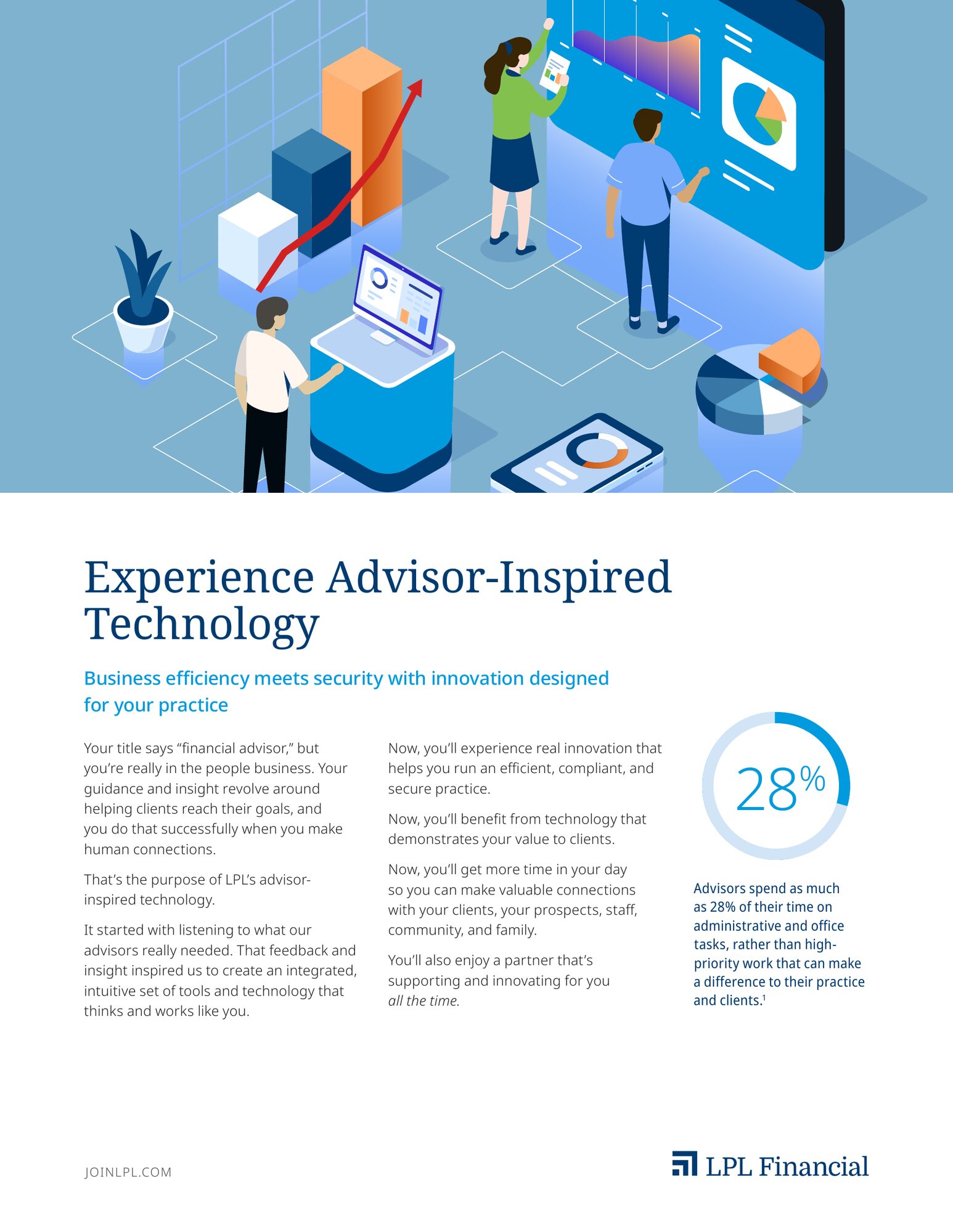
At LPL I worked across the 2021 rebrand, carrying the new system into sales tools, brochures, research reports, public and government relations pieces, infographics and content series art. At Capital Group I designed corporate communications, HR and benefits pieces, infographics and editorial for the company's culture and community programs.
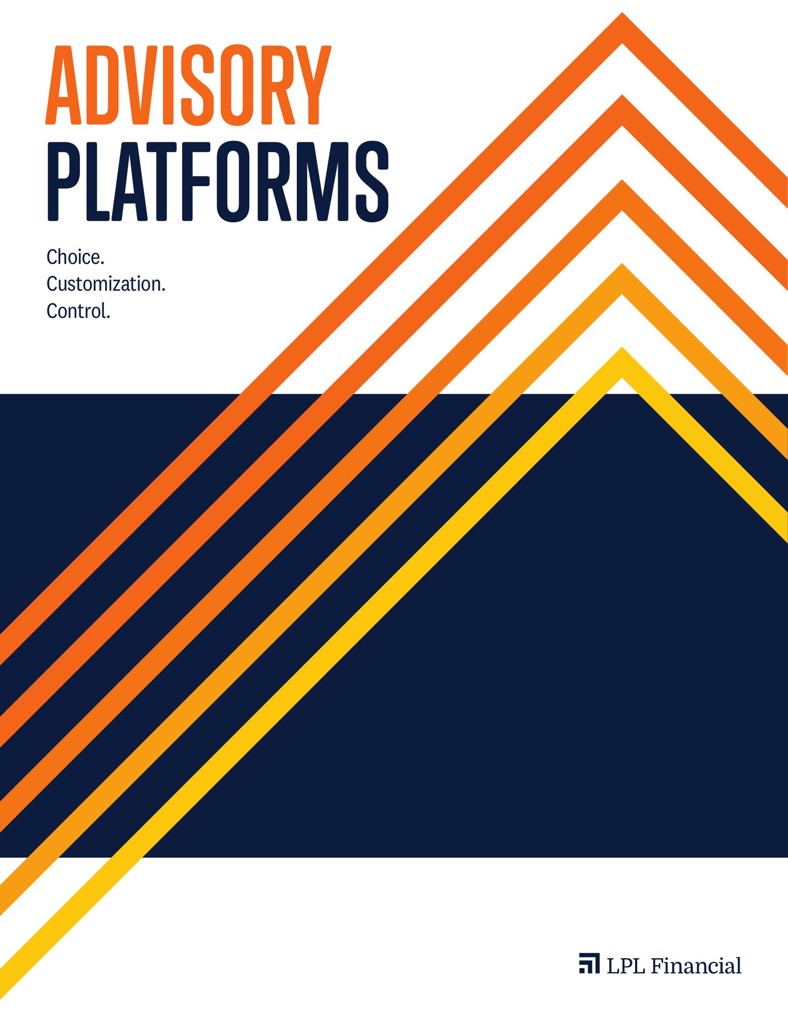
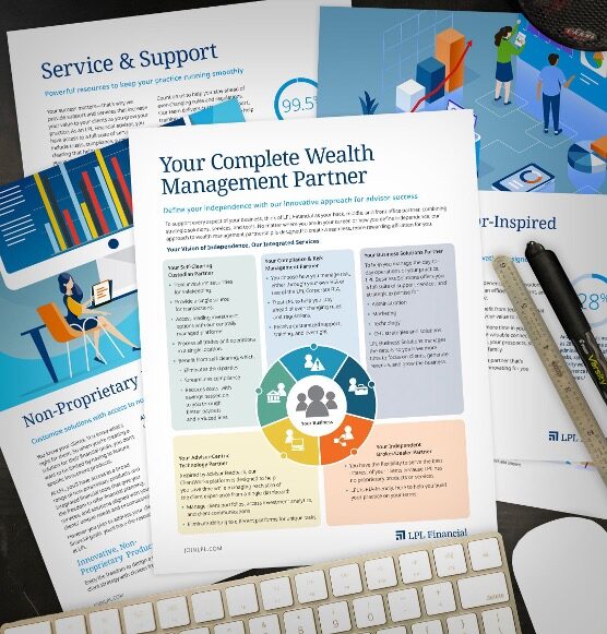
Tools advisors actually use
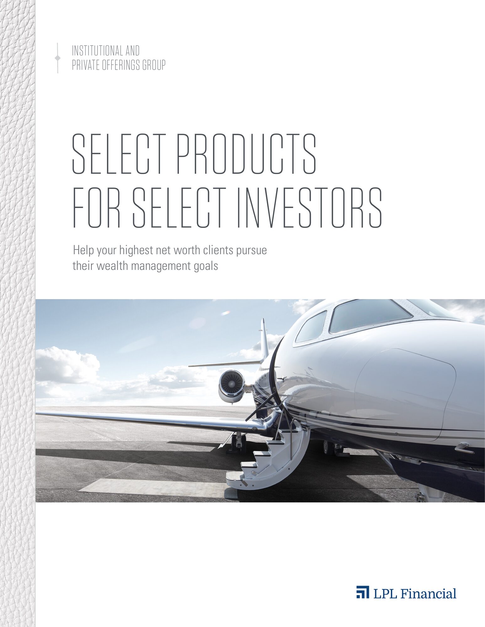
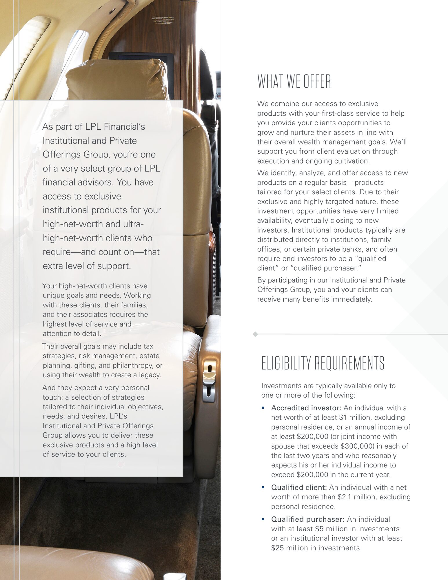
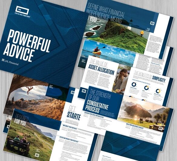
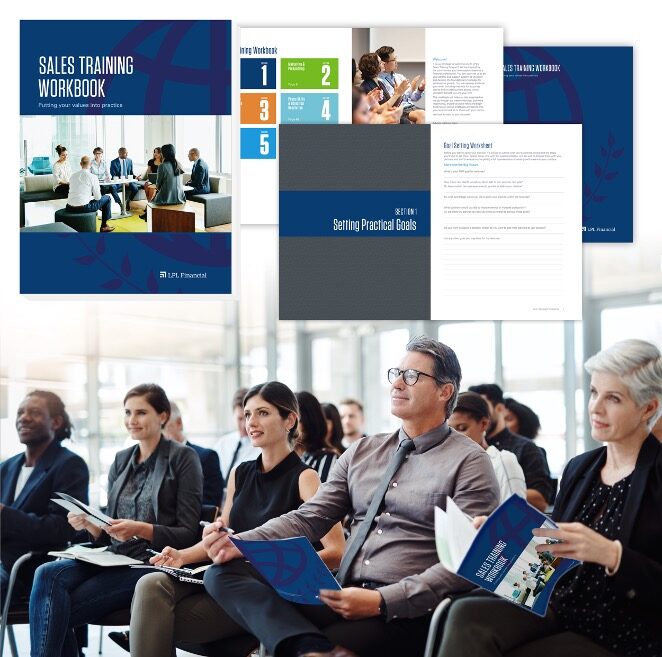
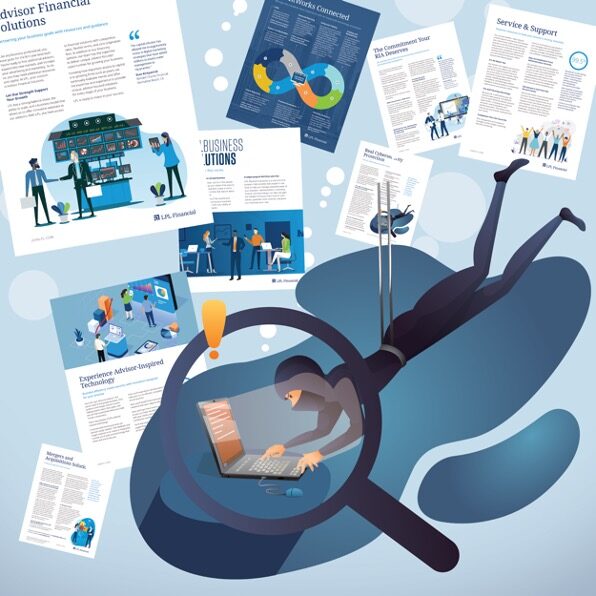
Workbooks, toolkits and brochures for advisors and their clients, where clarity matters more than decoration. Private jets, open skies and calm water set the tone for products aimed at high-net-worth investors.

You deserve our best
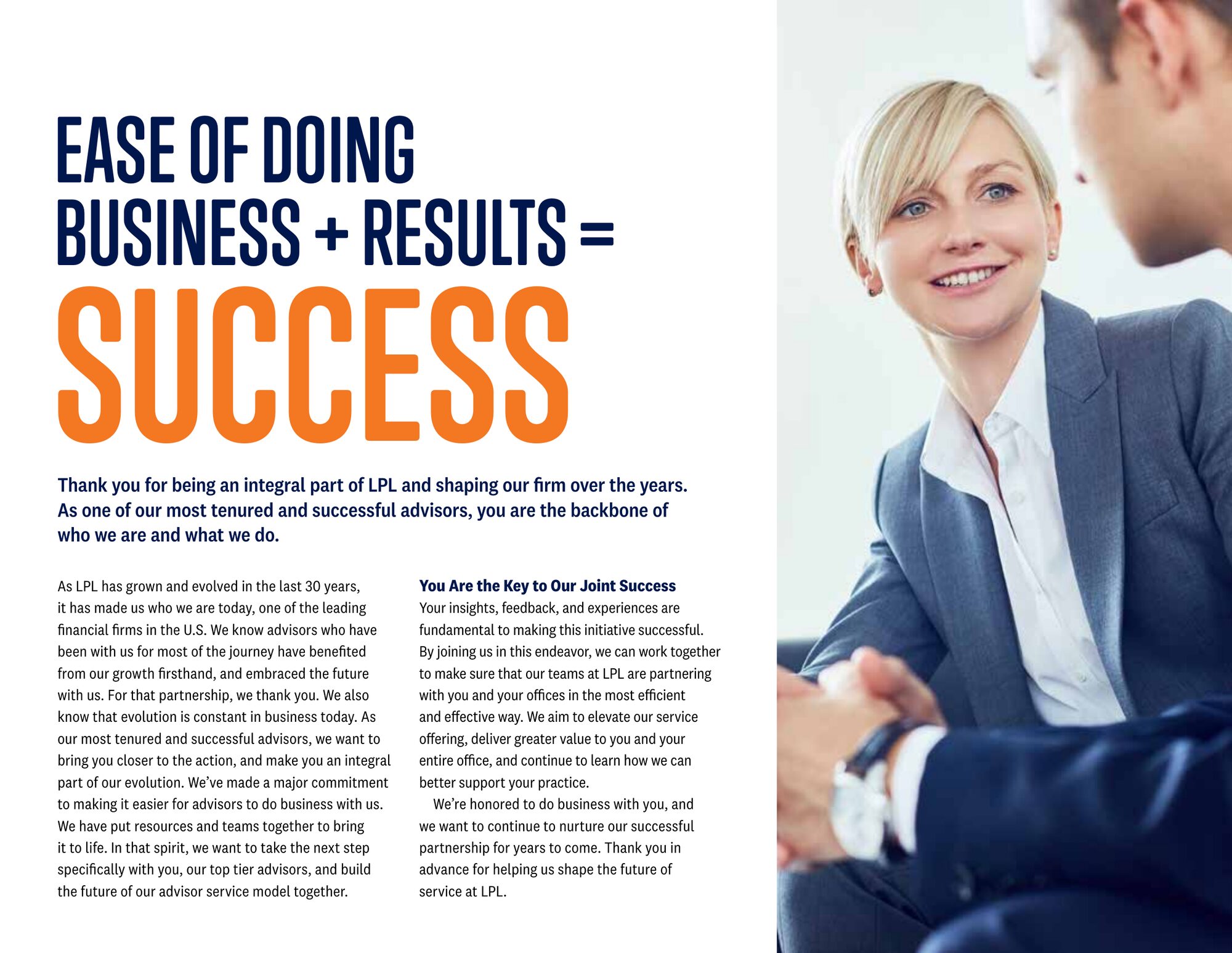
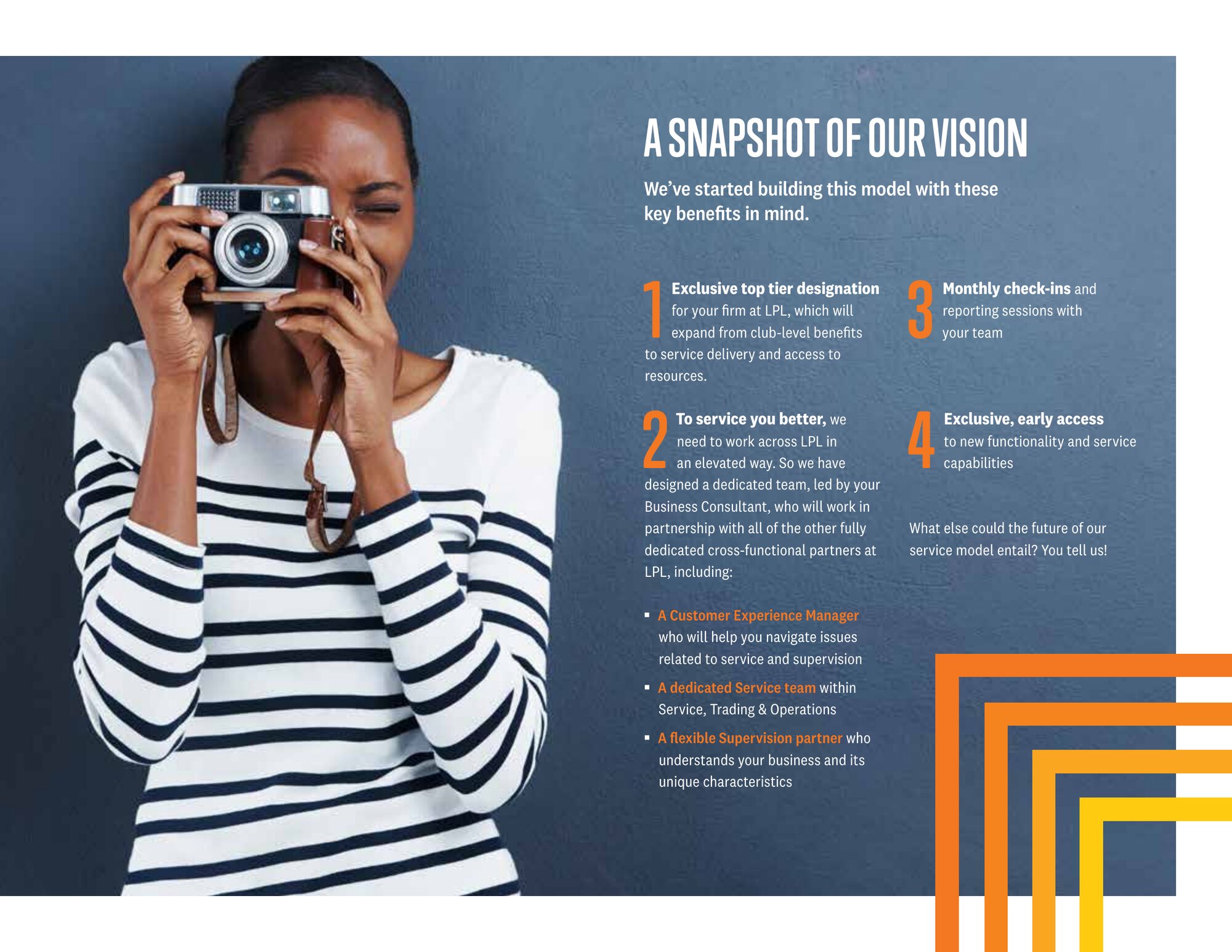
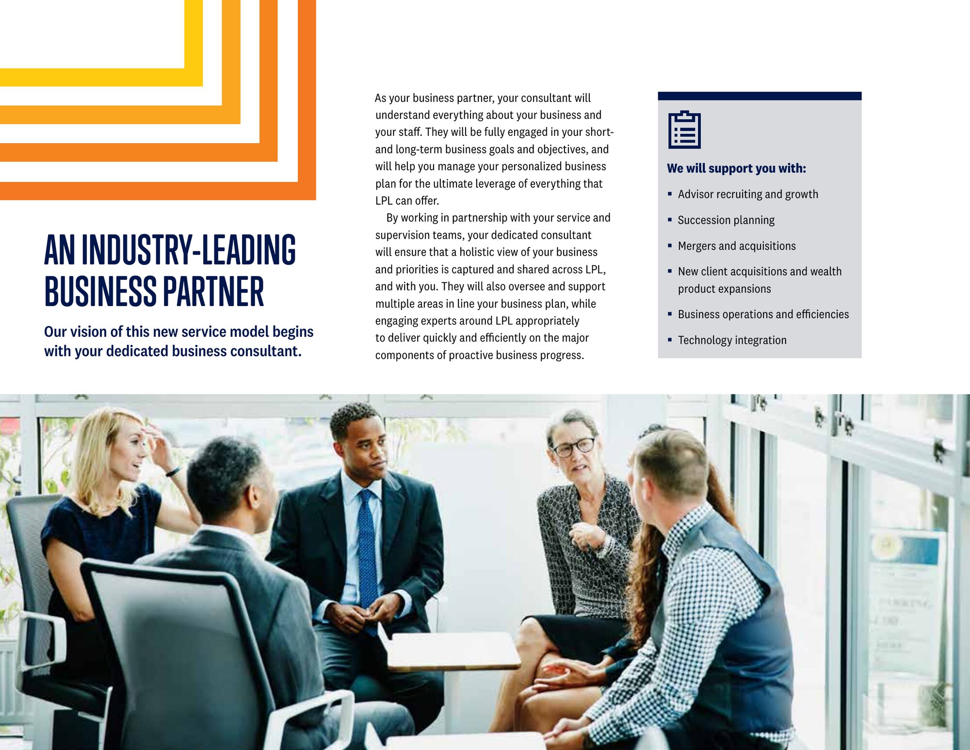
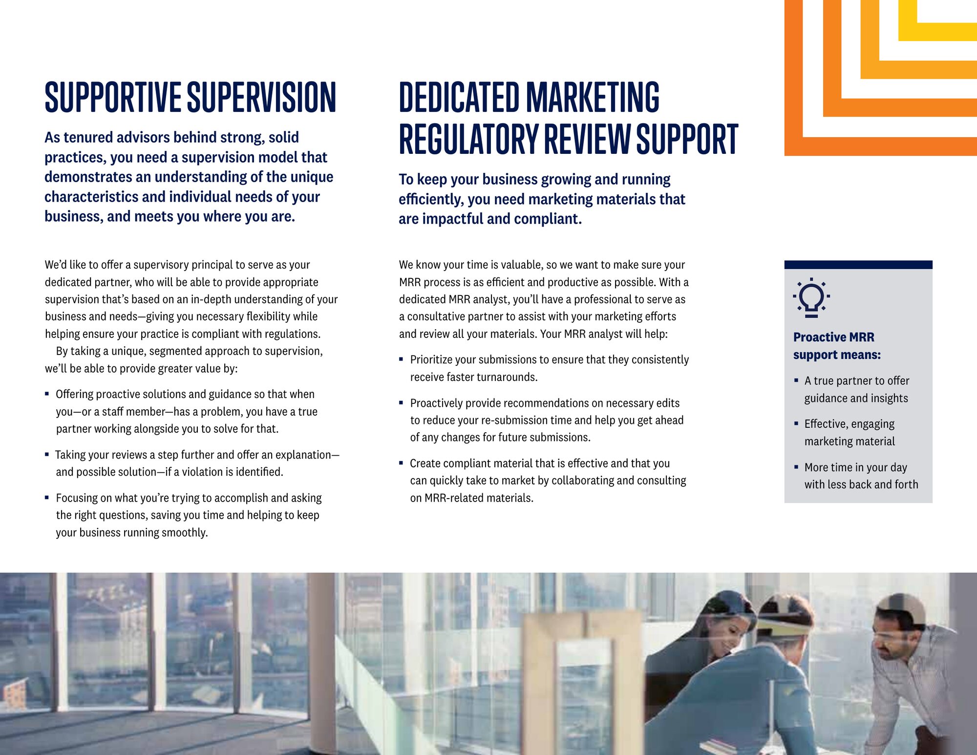
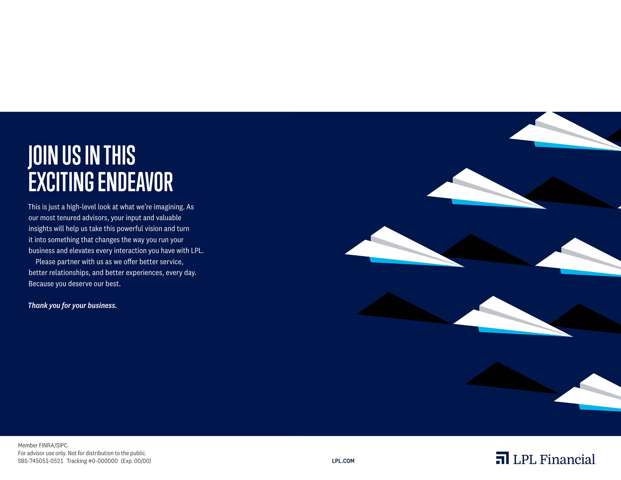
The Customer Success Model brochure introduced LPL's new service model to its advisors: a dedicated business consultant, embedded case management, supervision and marketing review support.
Paper airplanes became the through line. A lone orange plane leads the formation on the cover and the close, standing in for the advisor at the front of a team built around them. Bold condensed headlines and the rebrand's orange carry each spread so the promise reads before the detail.


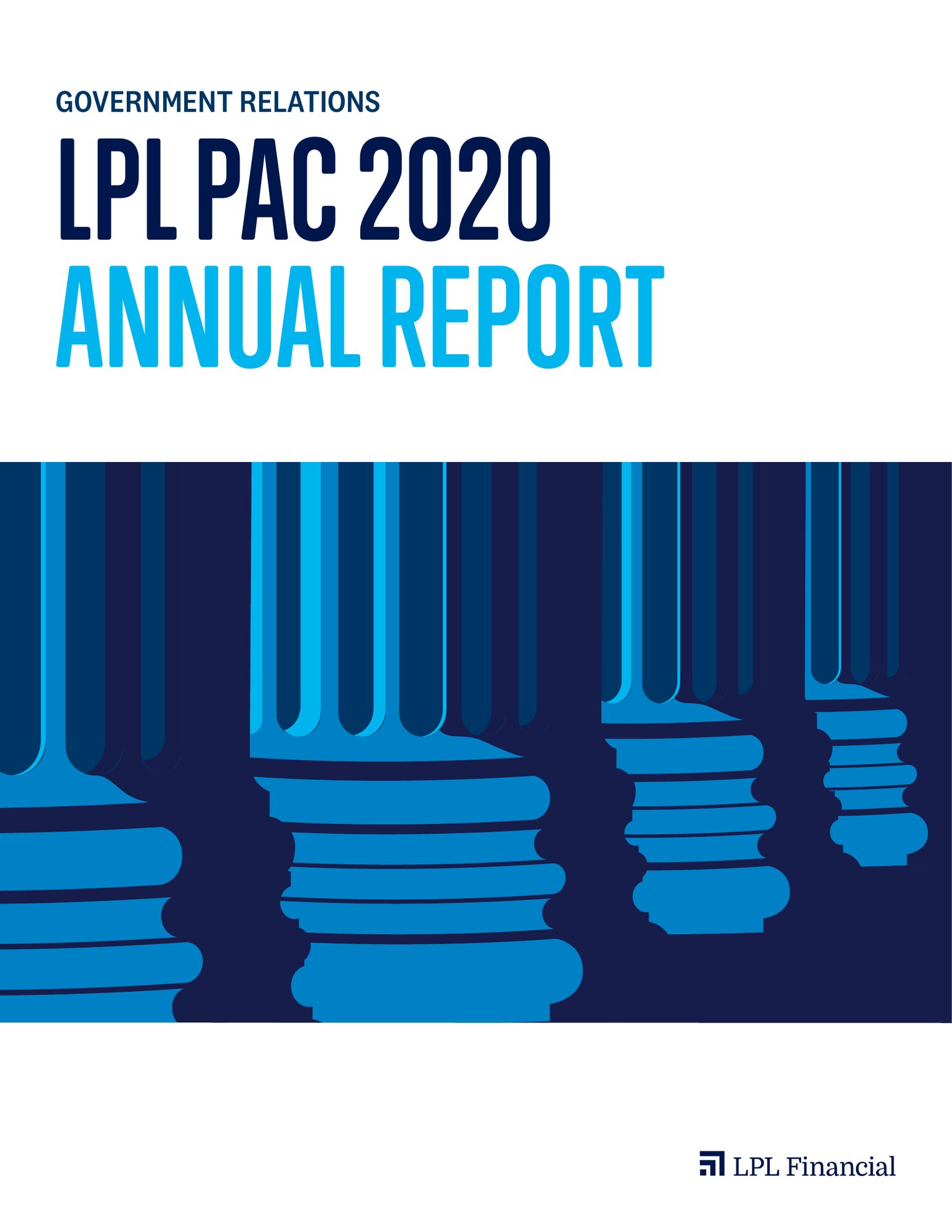
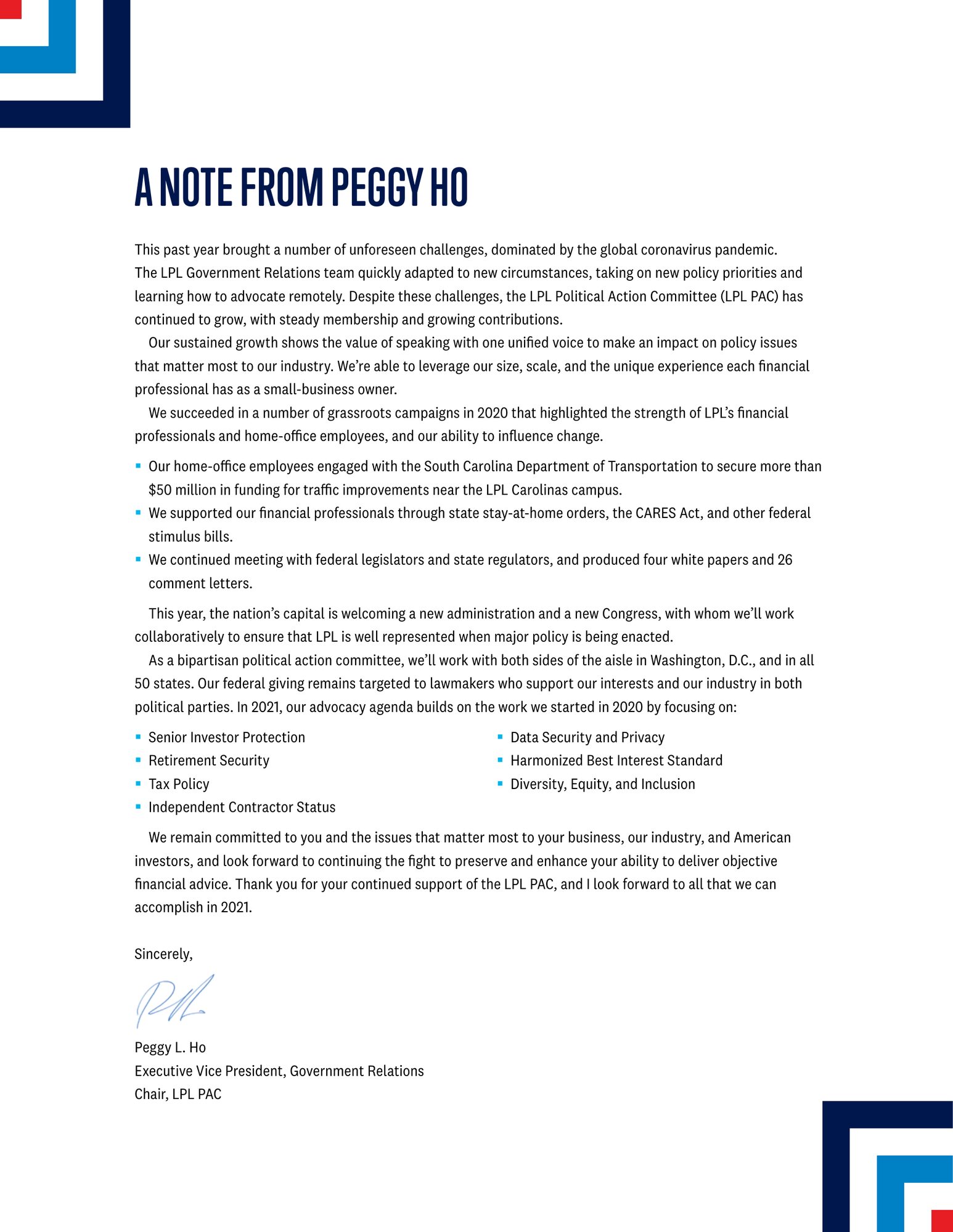
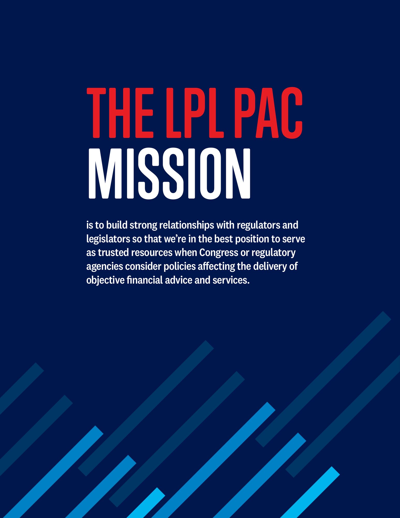
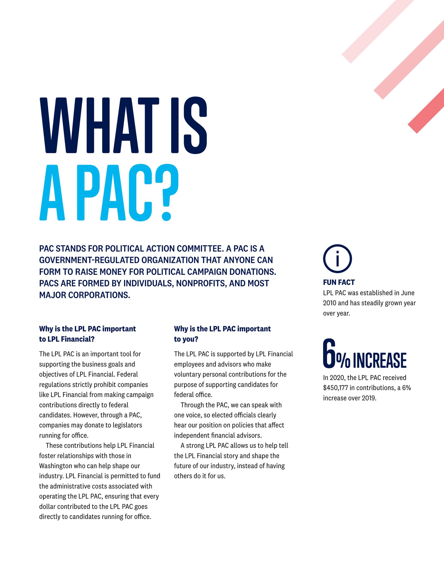
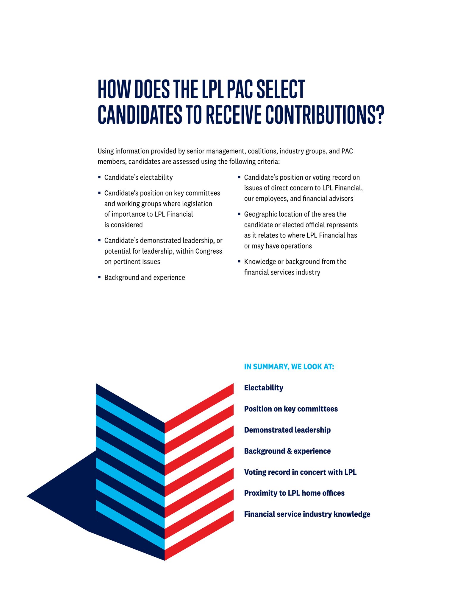
The 2020 PAC annual report
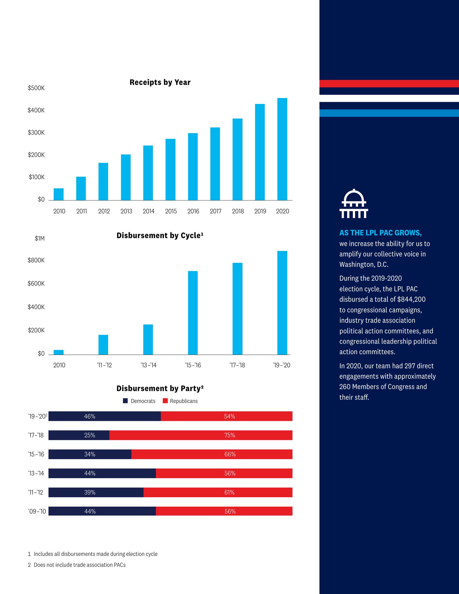
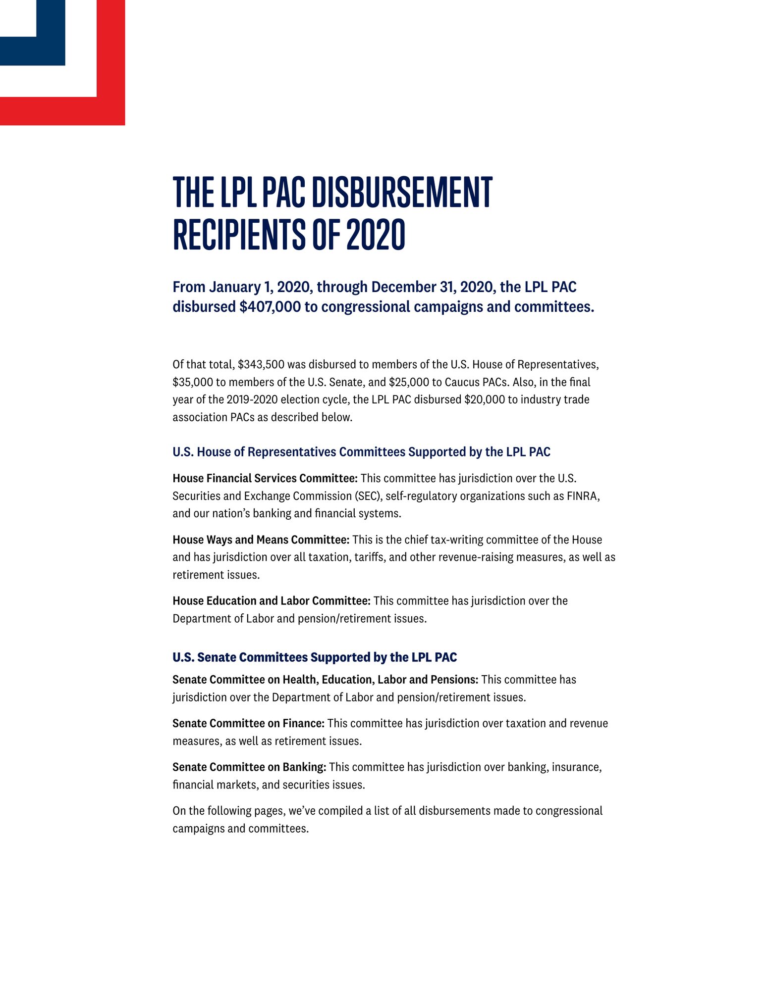
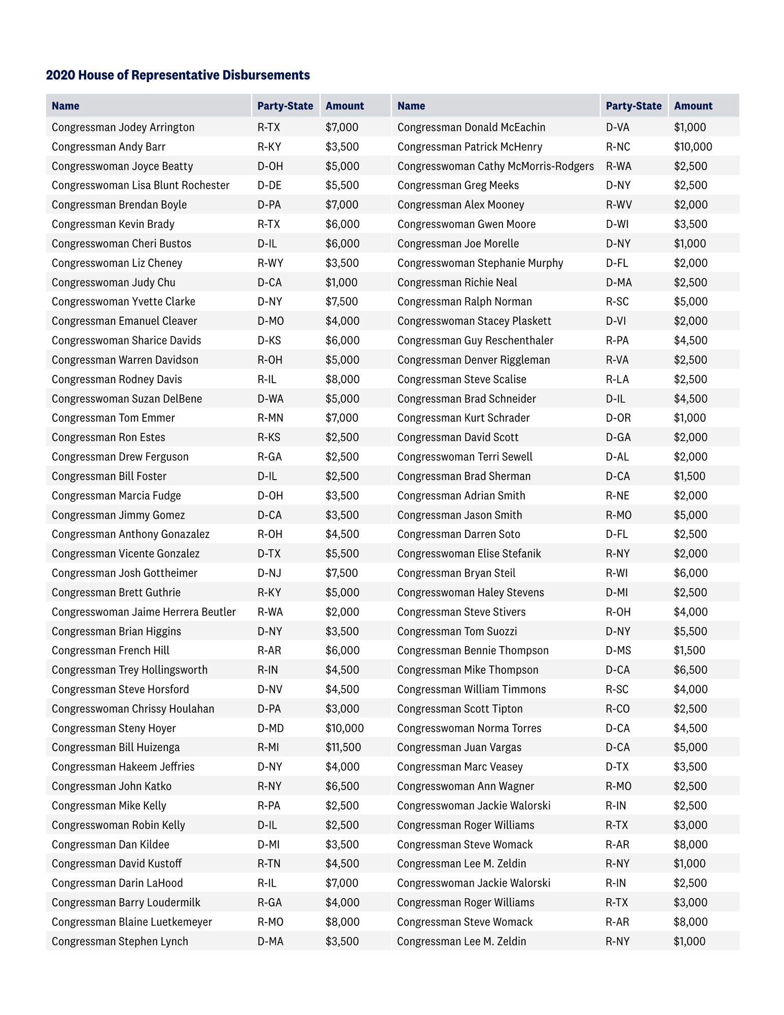
LPL's political action committee reports each year to the employees who fund it. The report had to explain what a PAC is, how candidates are chosen and where every dollar went, without reading like a filing.
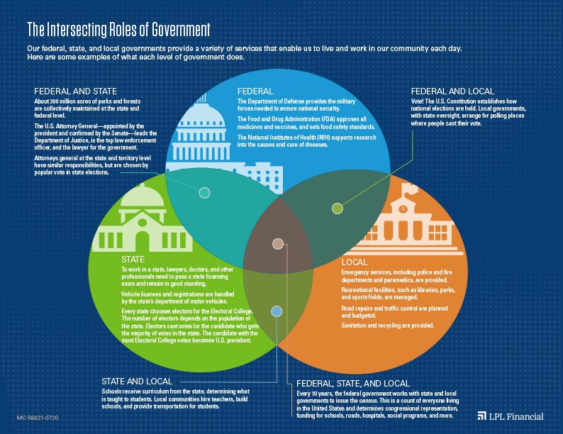
The Capitol dome and column motifs give each section a strong opener, and the charts break contributions down by year, by party and by cycle so the numbers are easy to scan. A companion infographic shows how the branches of government intersect.


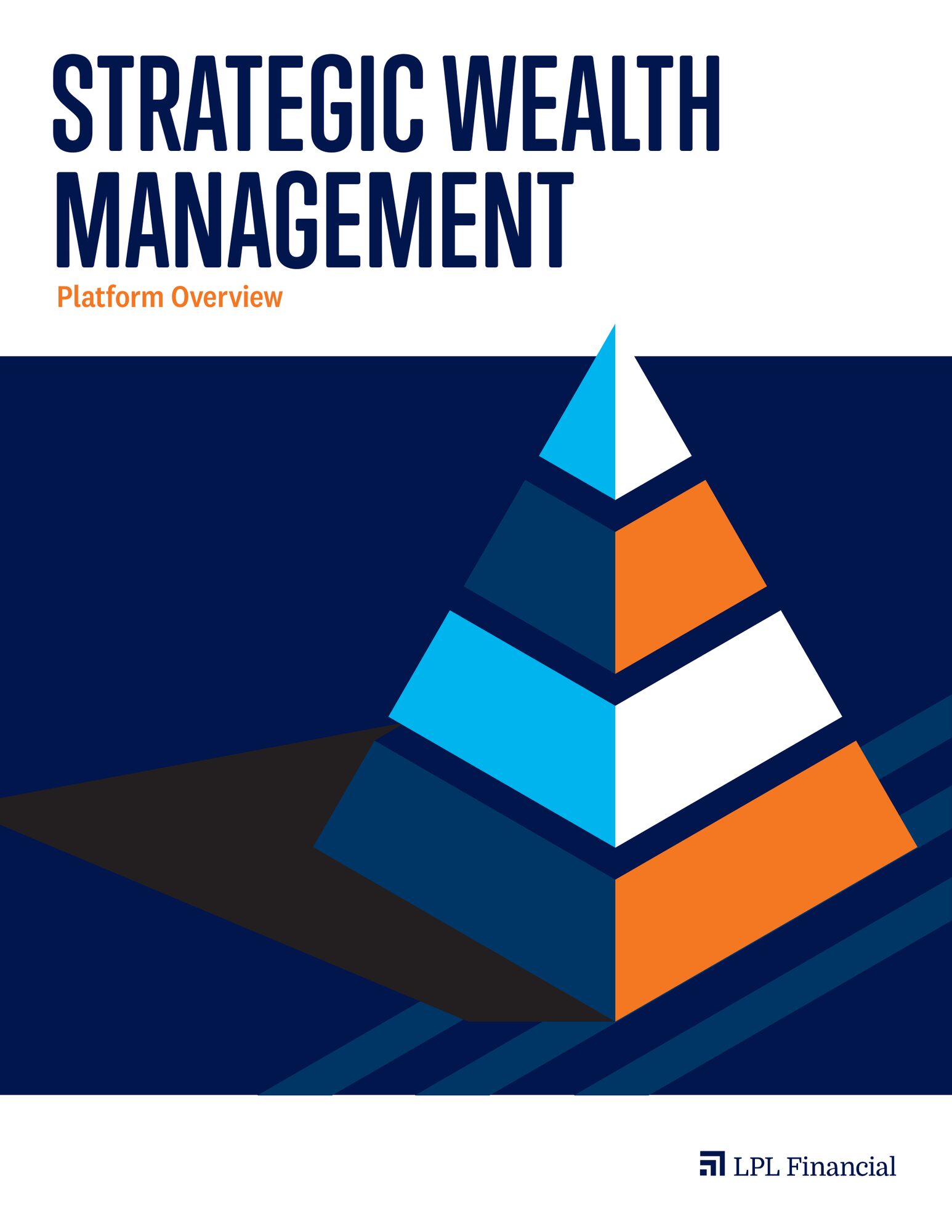
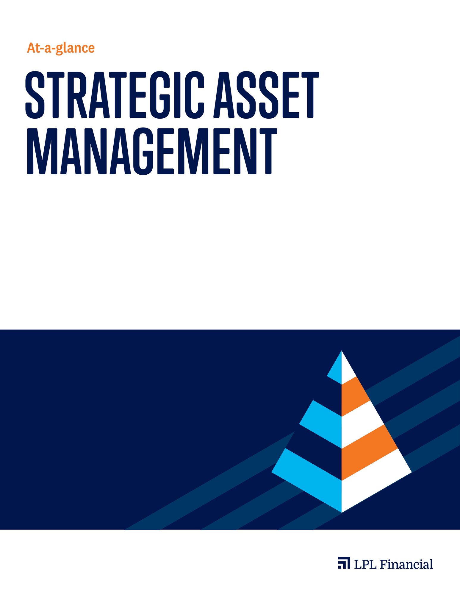
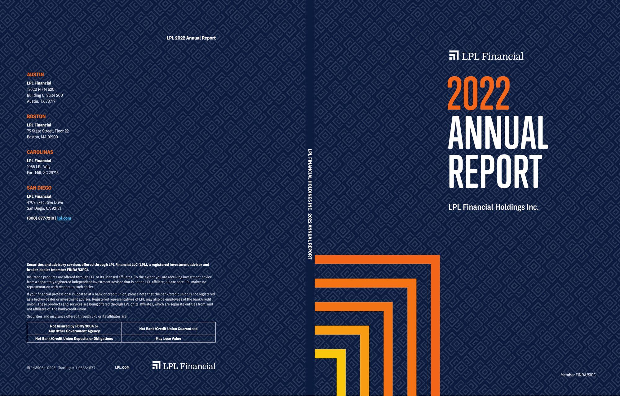
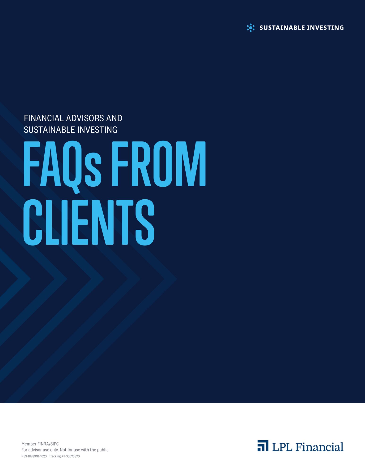
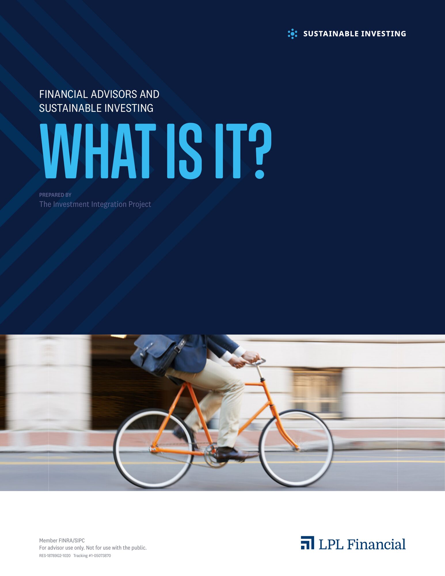
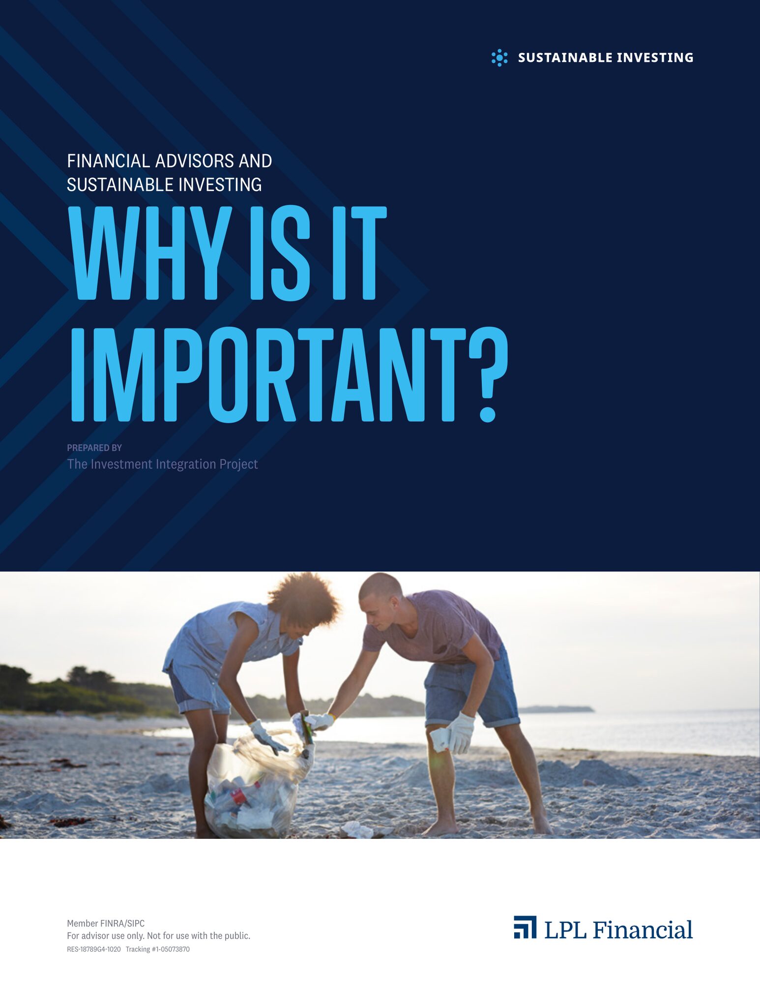
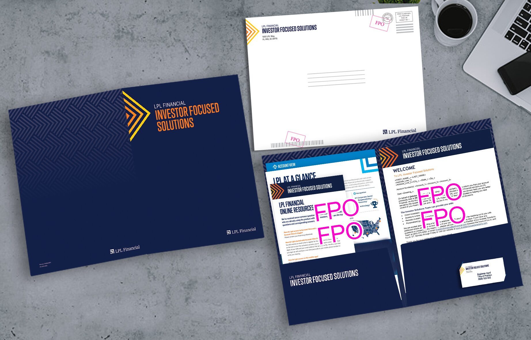
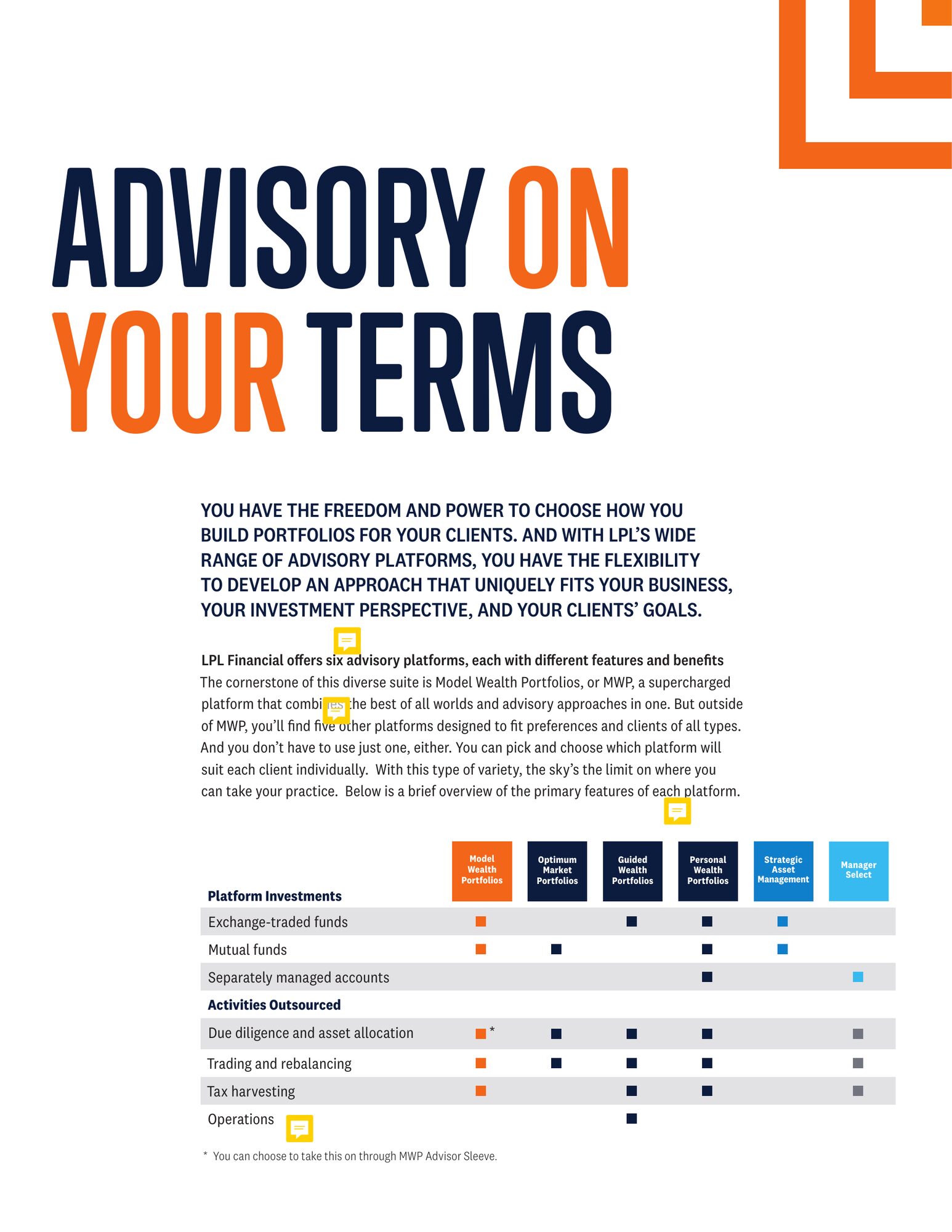
Rebranded, page by page



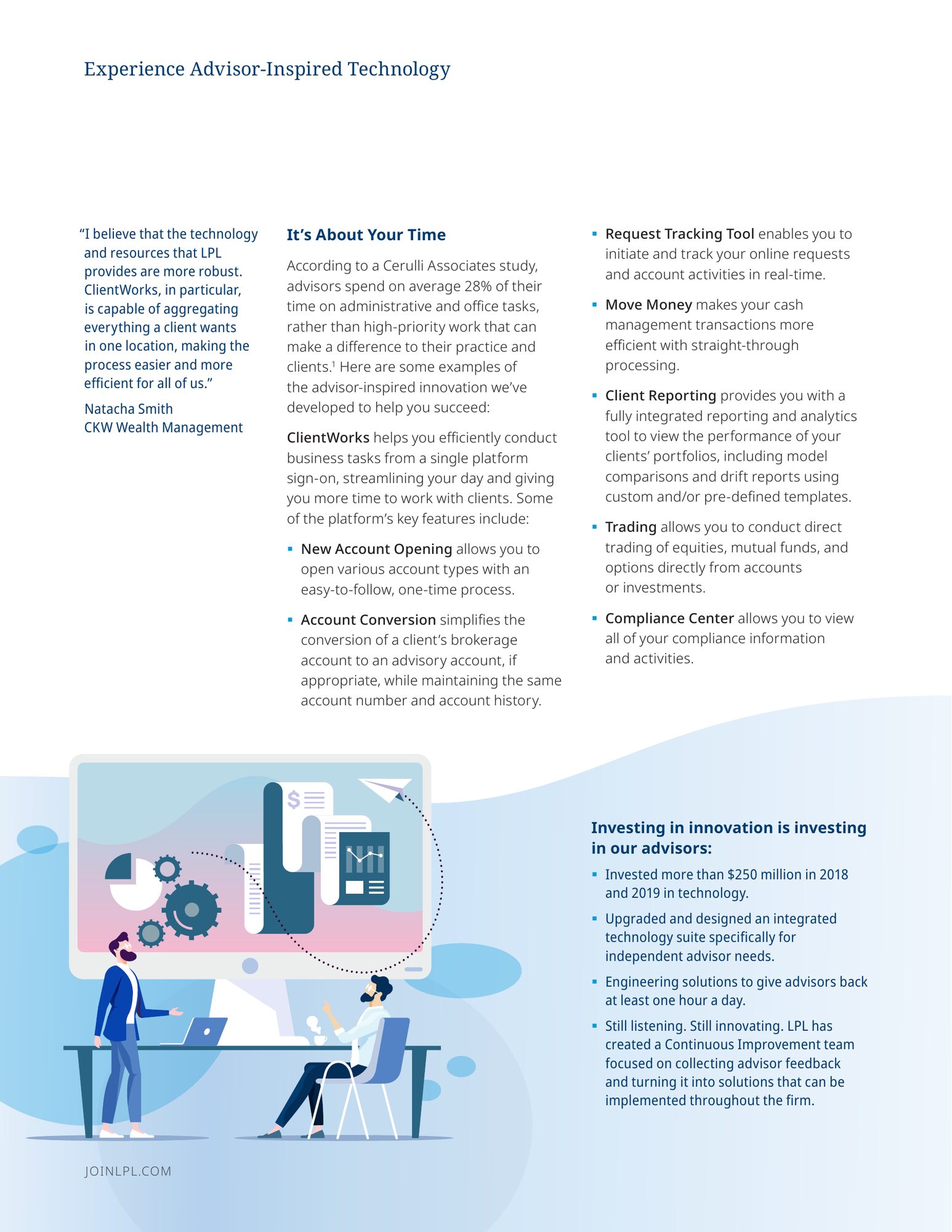
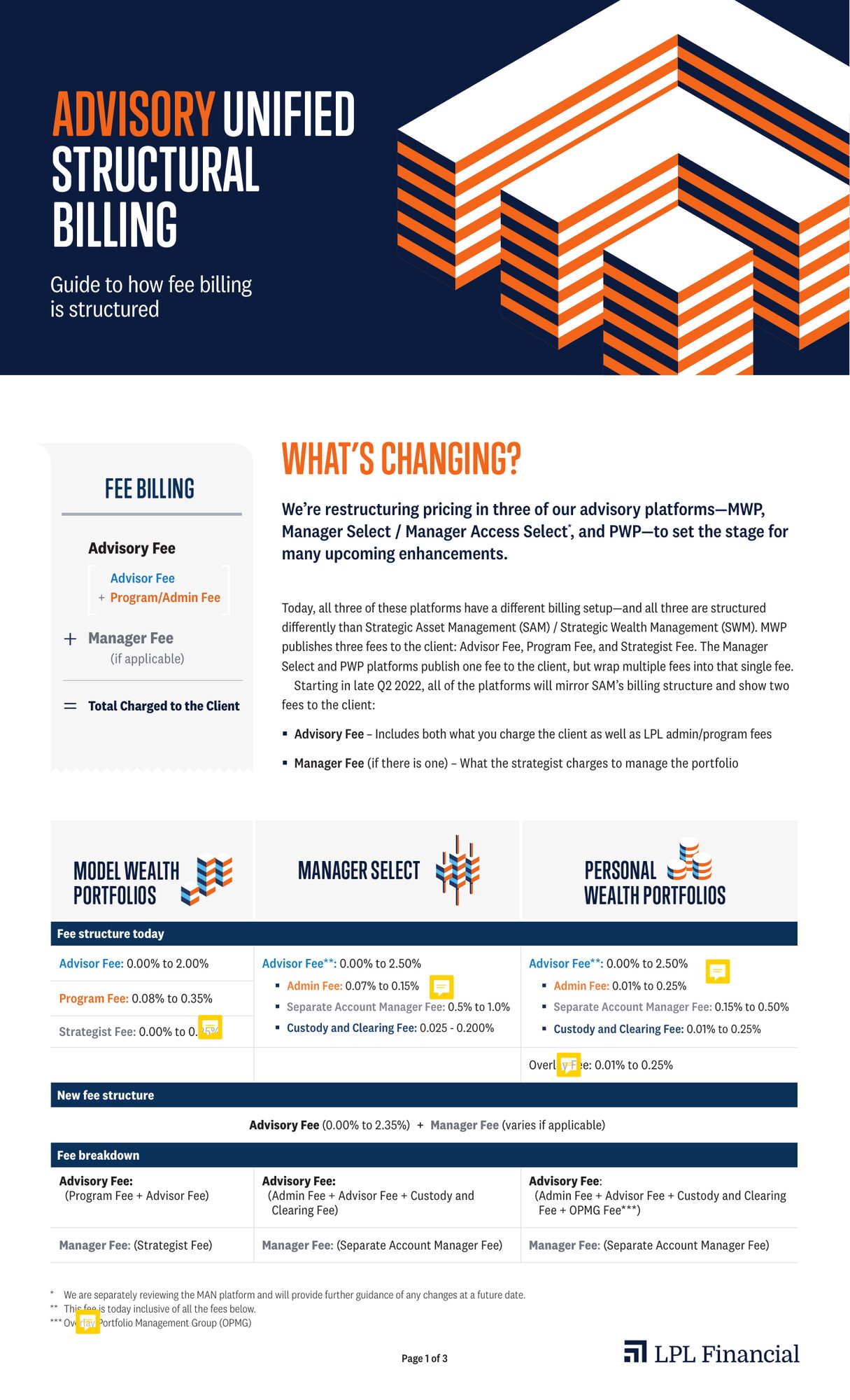
Making the data do the talking
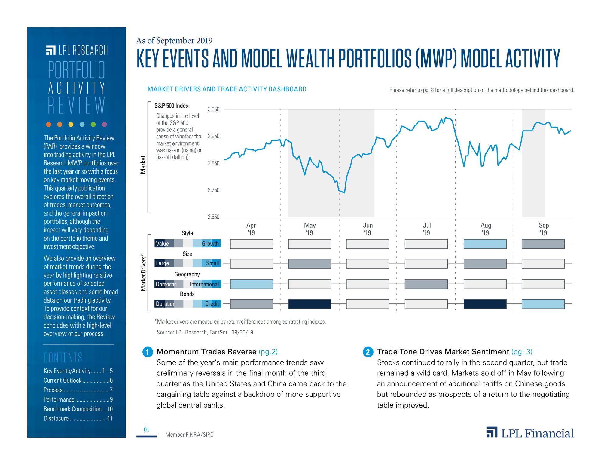
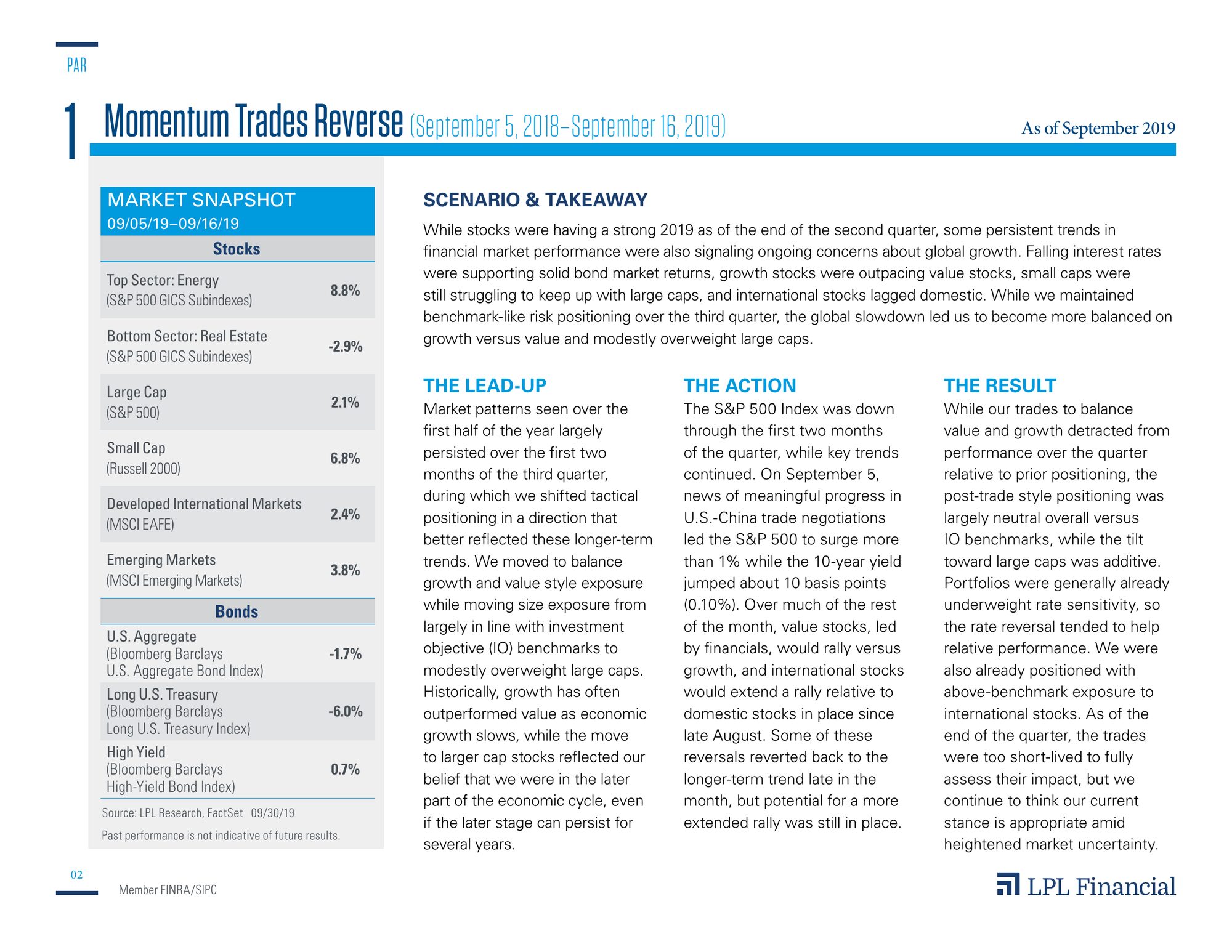
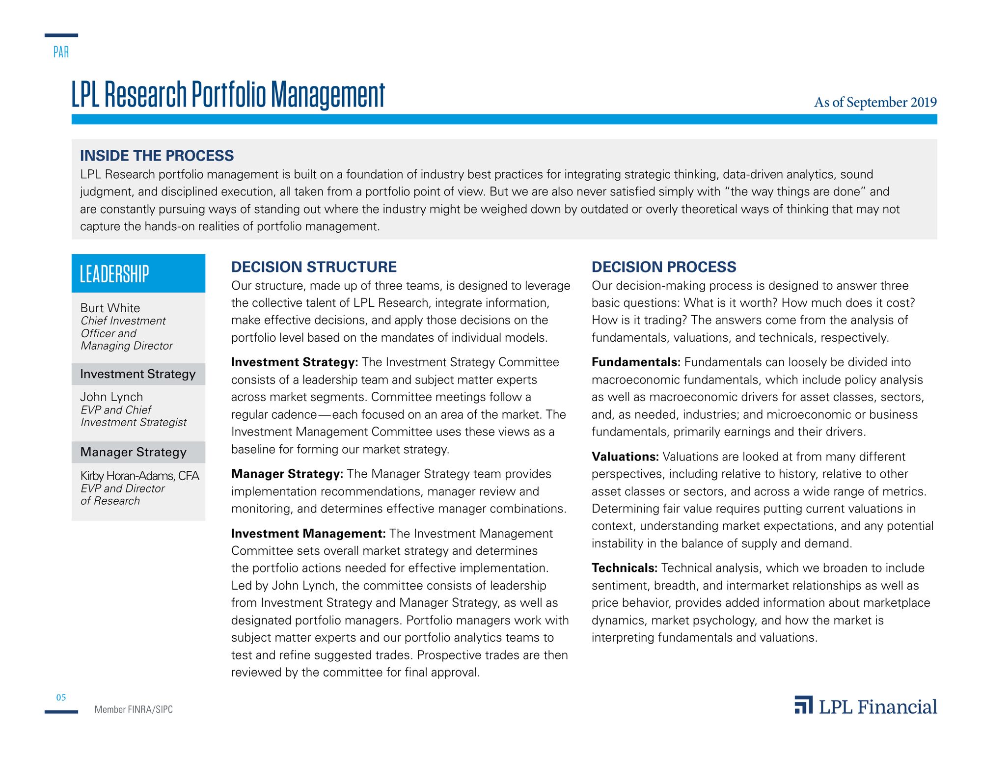
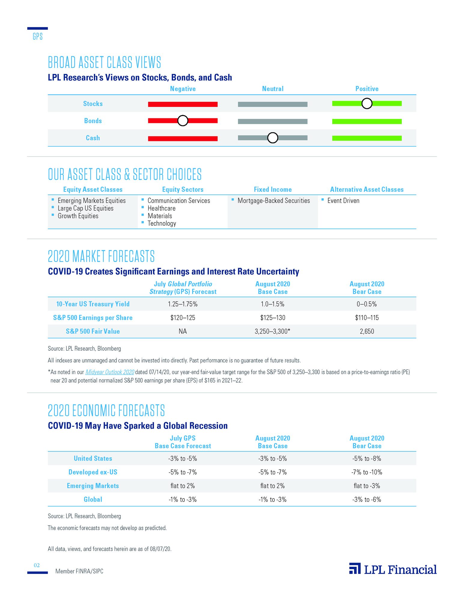
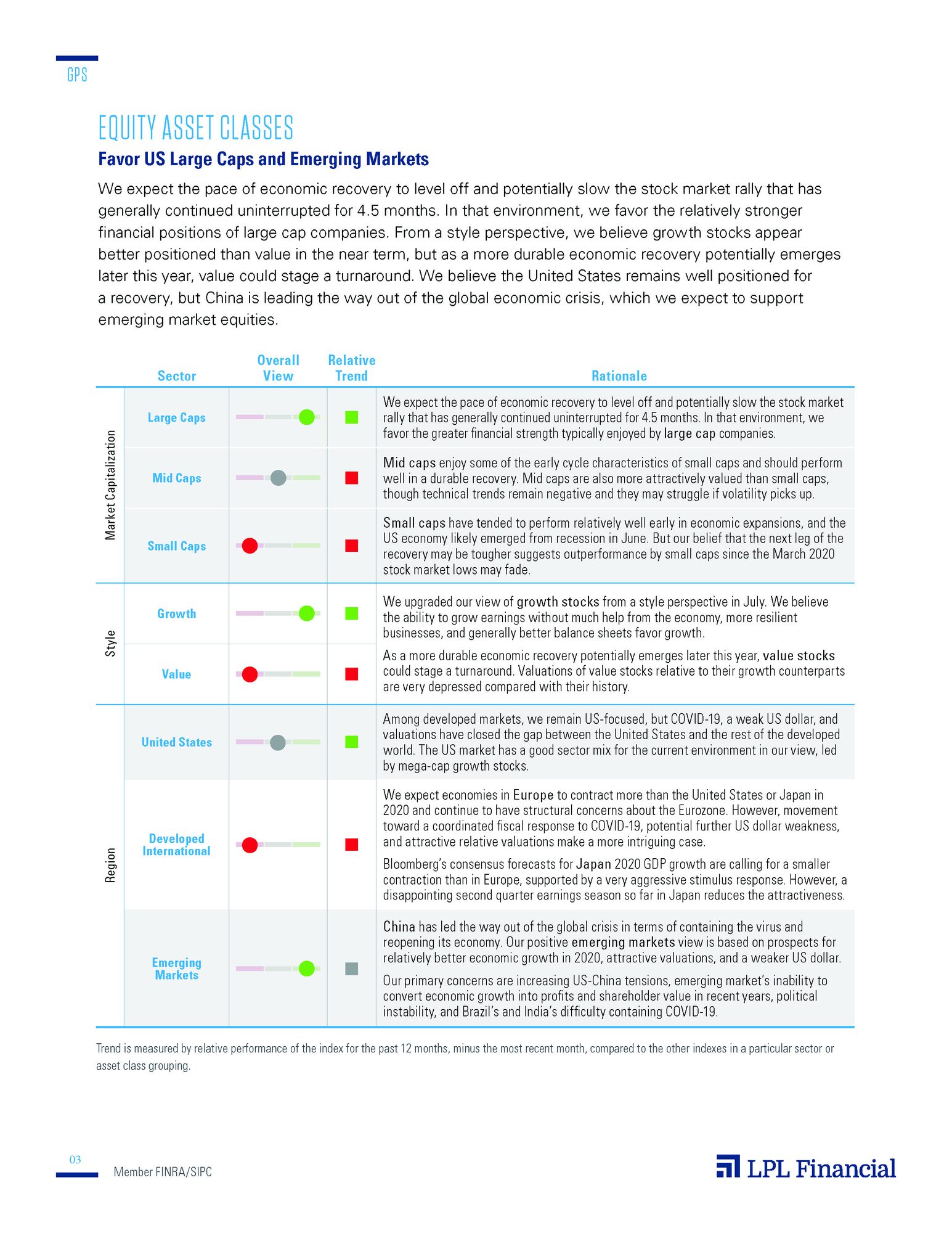
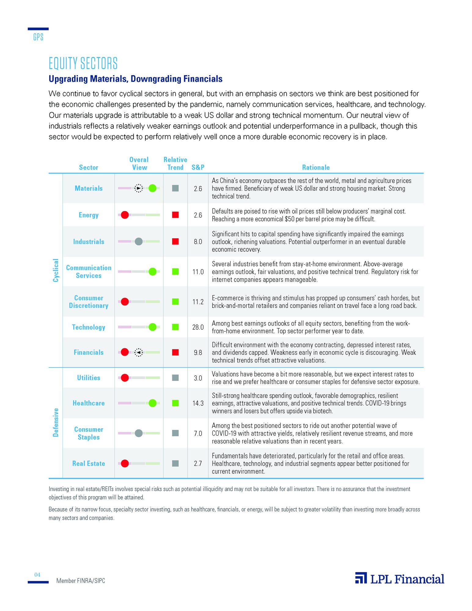
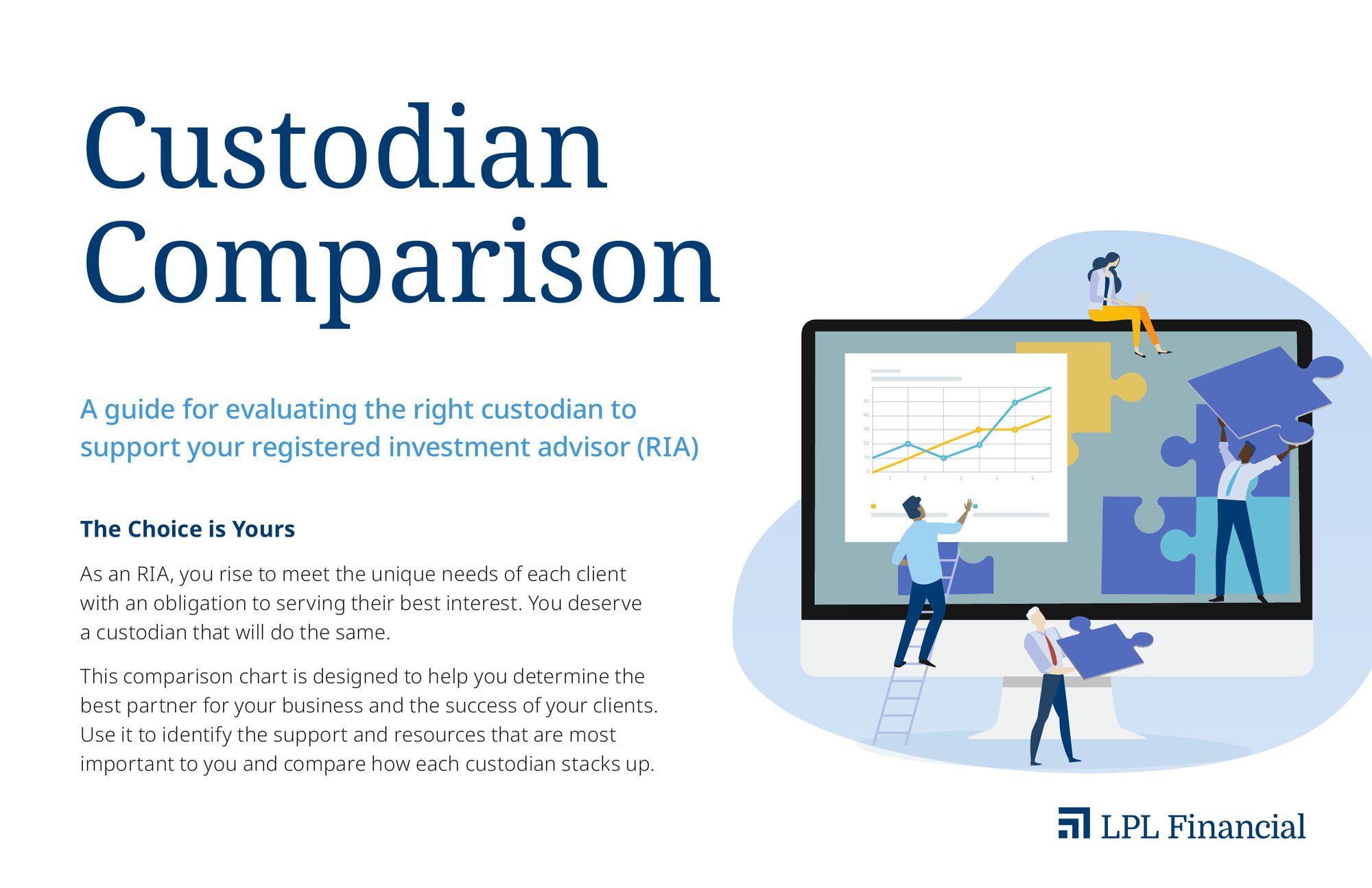
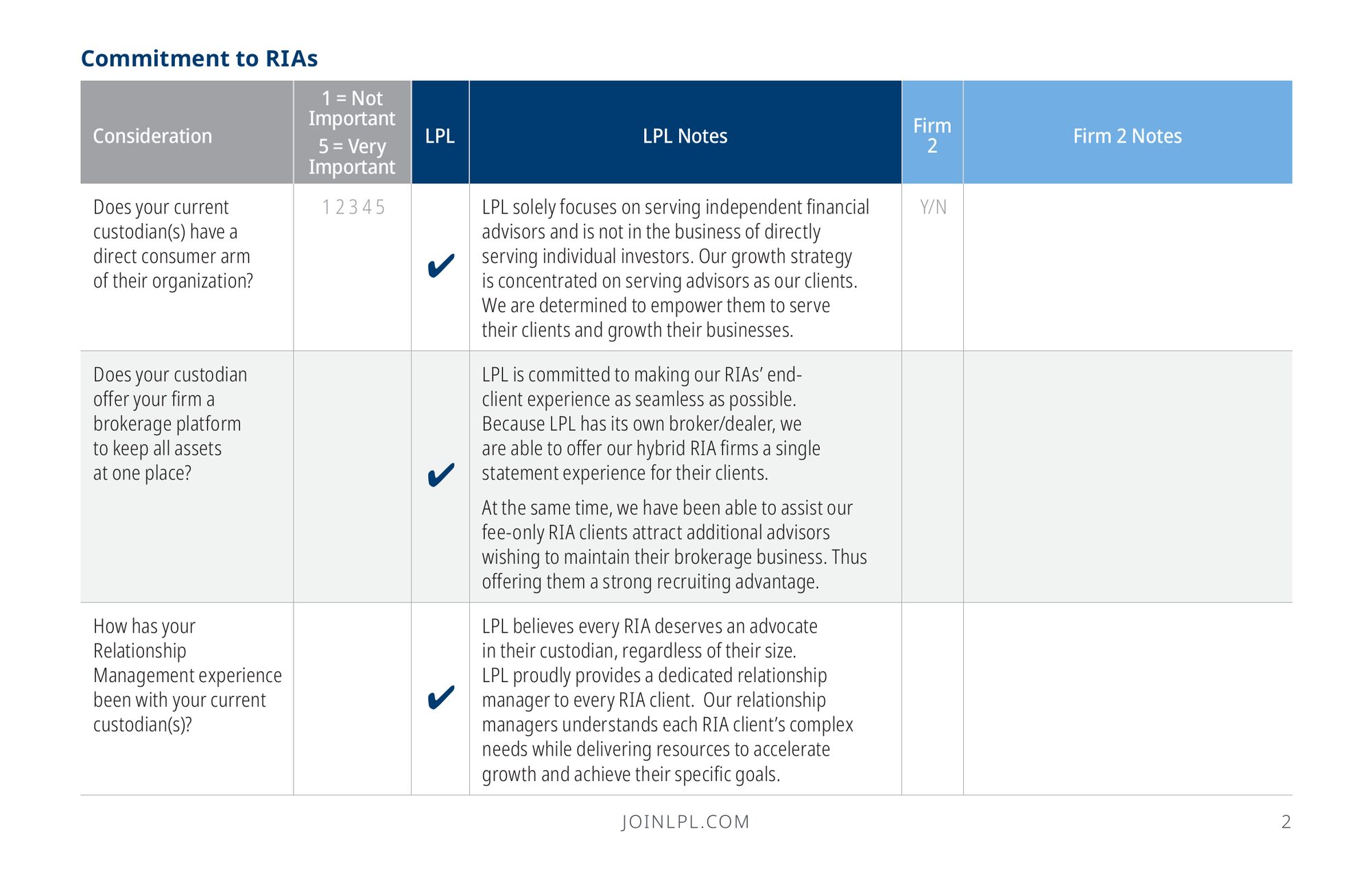
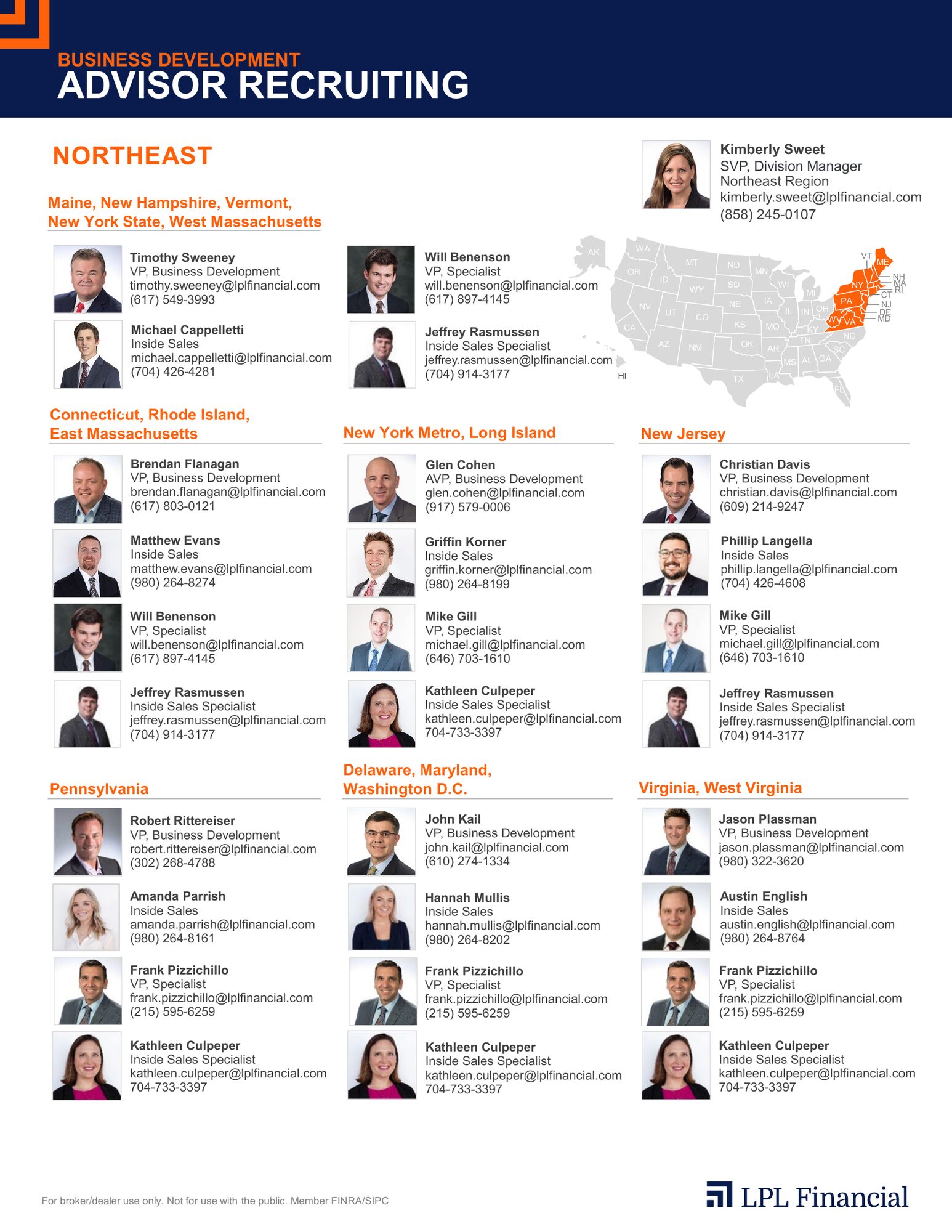
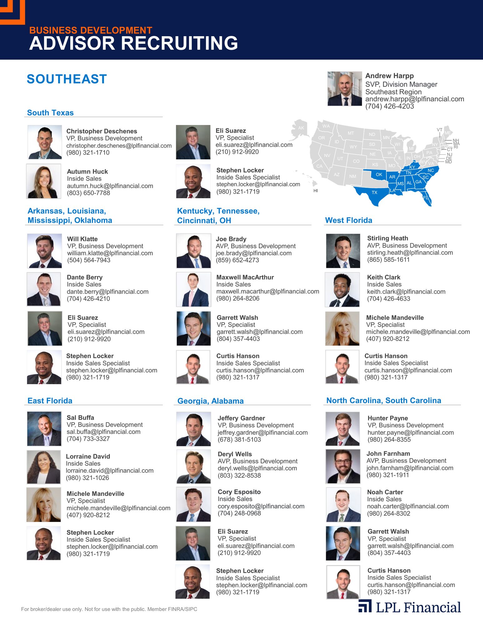
Research reports, comparisons and territory maps where the design job is to make dense data scannable: one clear chart per idea, consistent color for each asset class and plenty of room around the numbers.
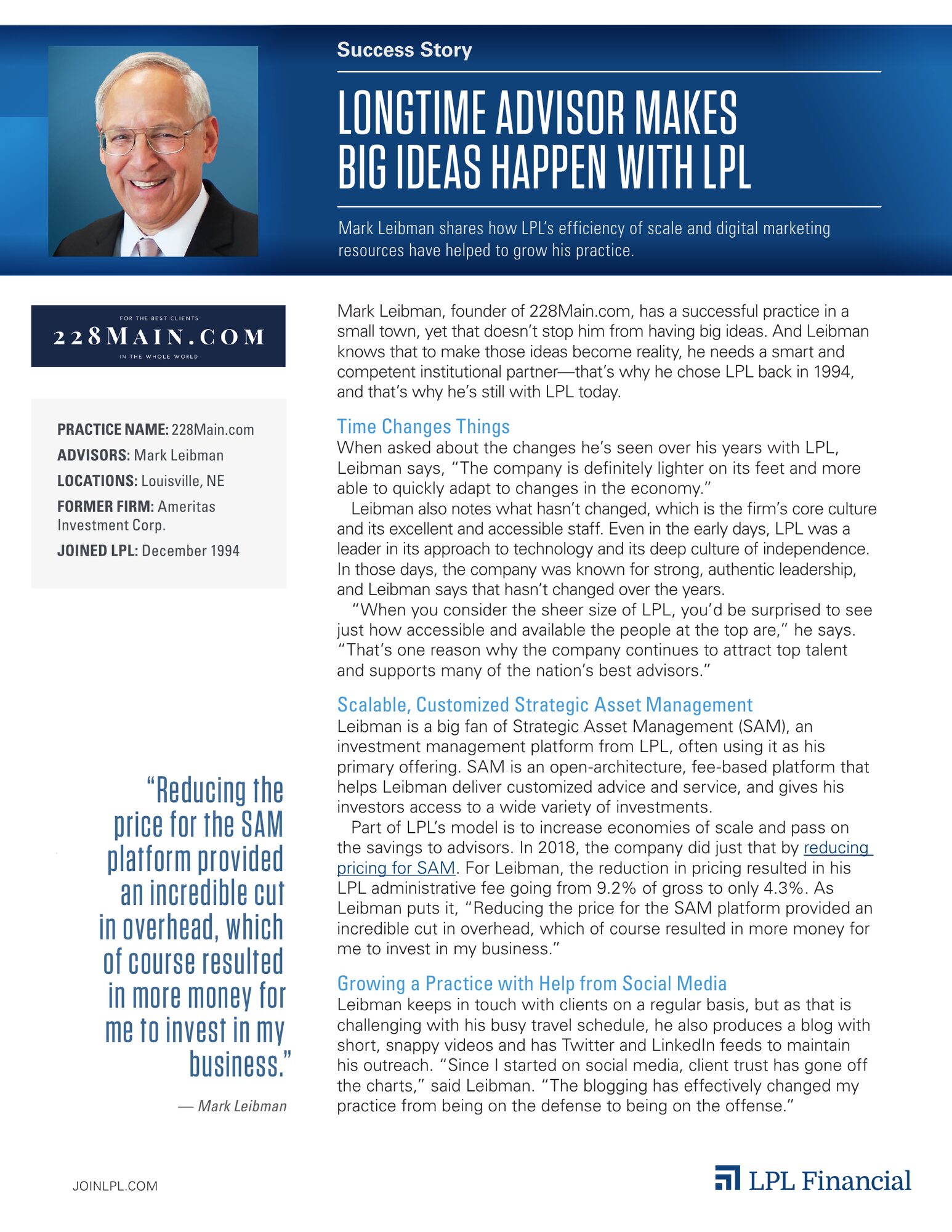
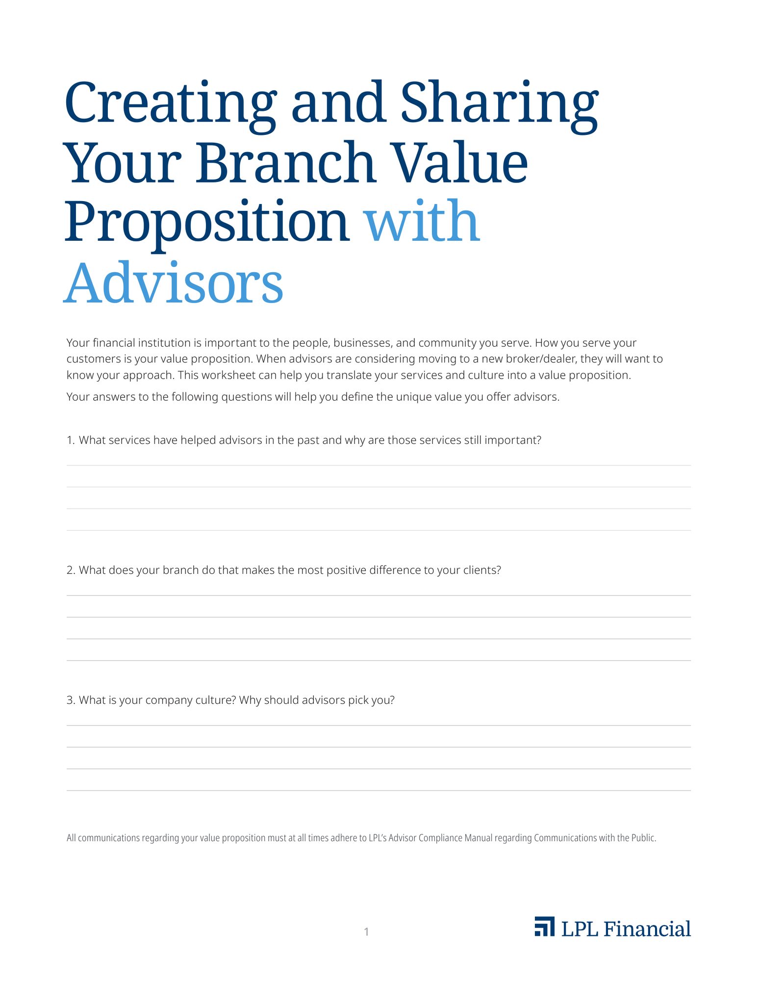
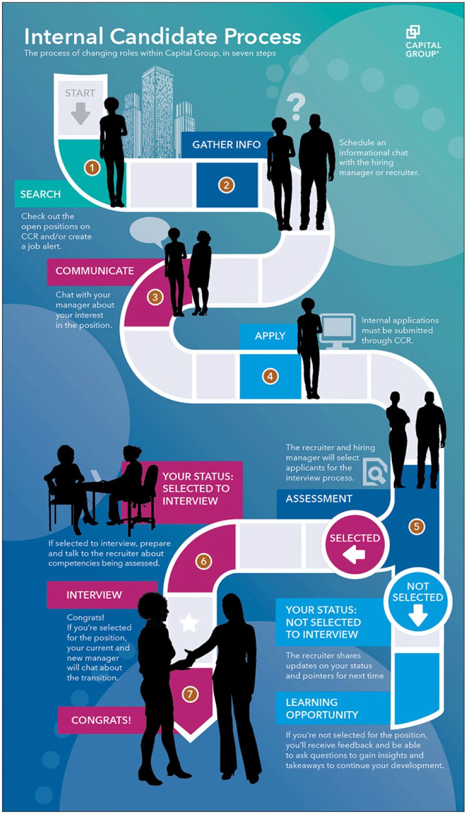
Process at a glance
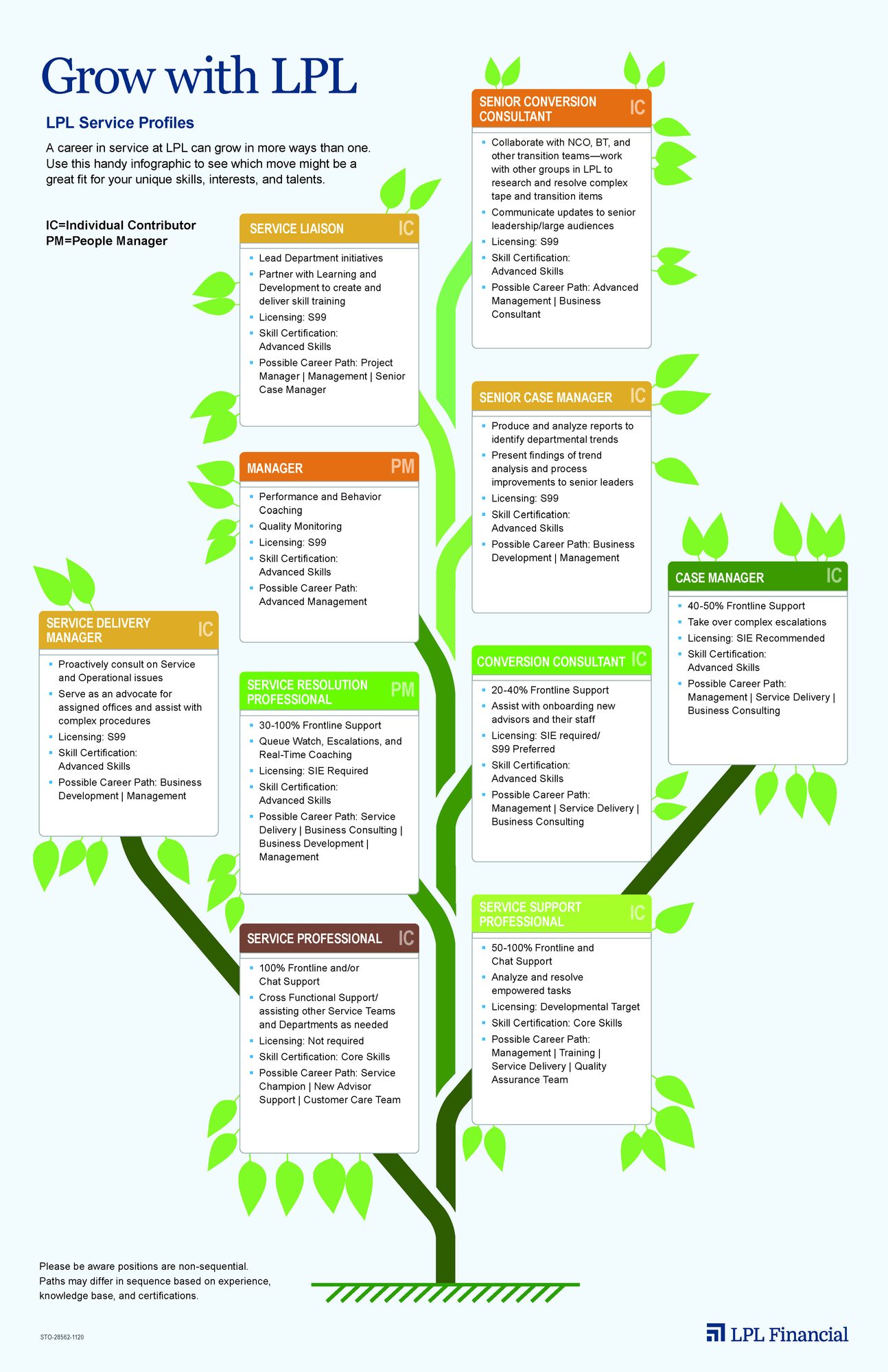
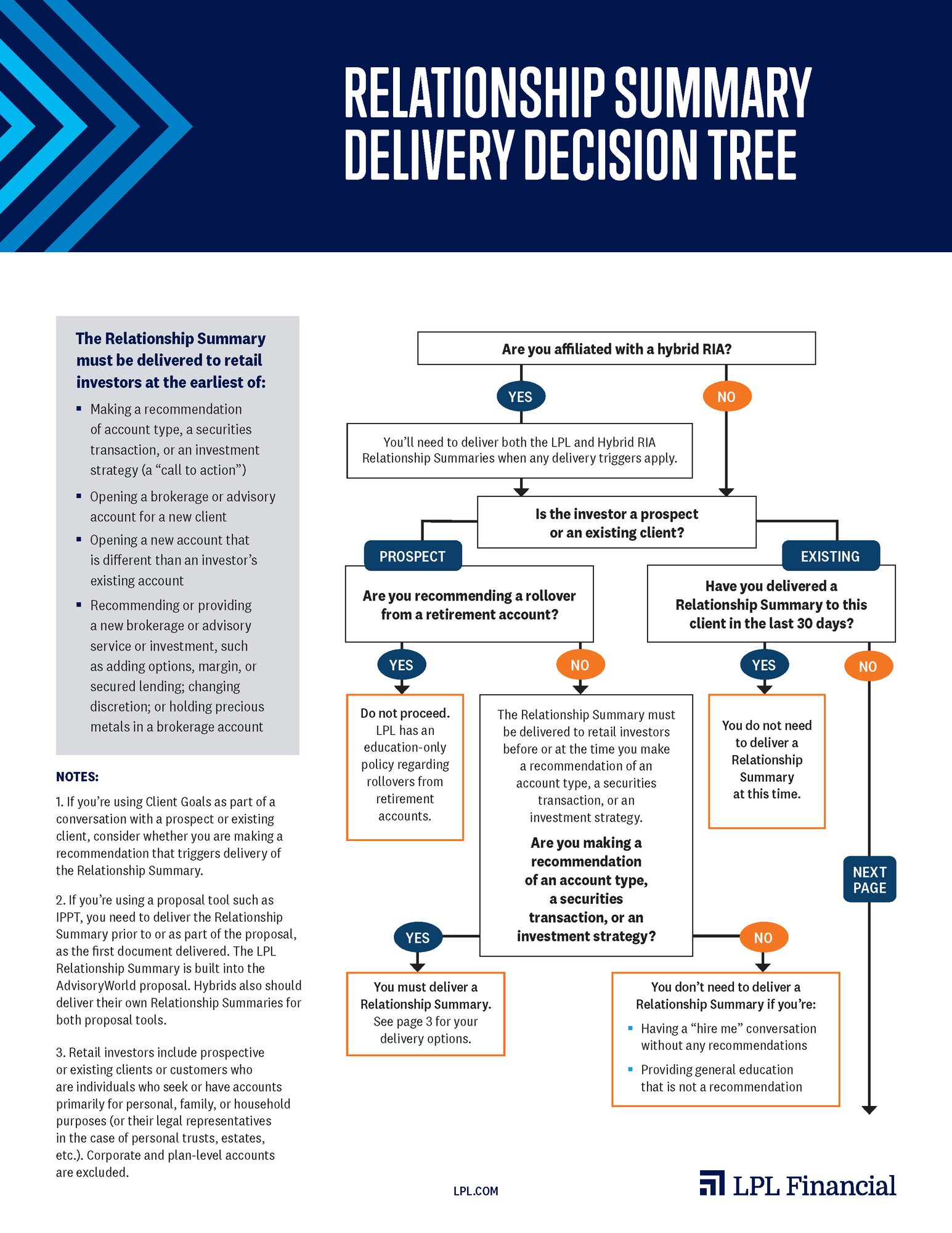
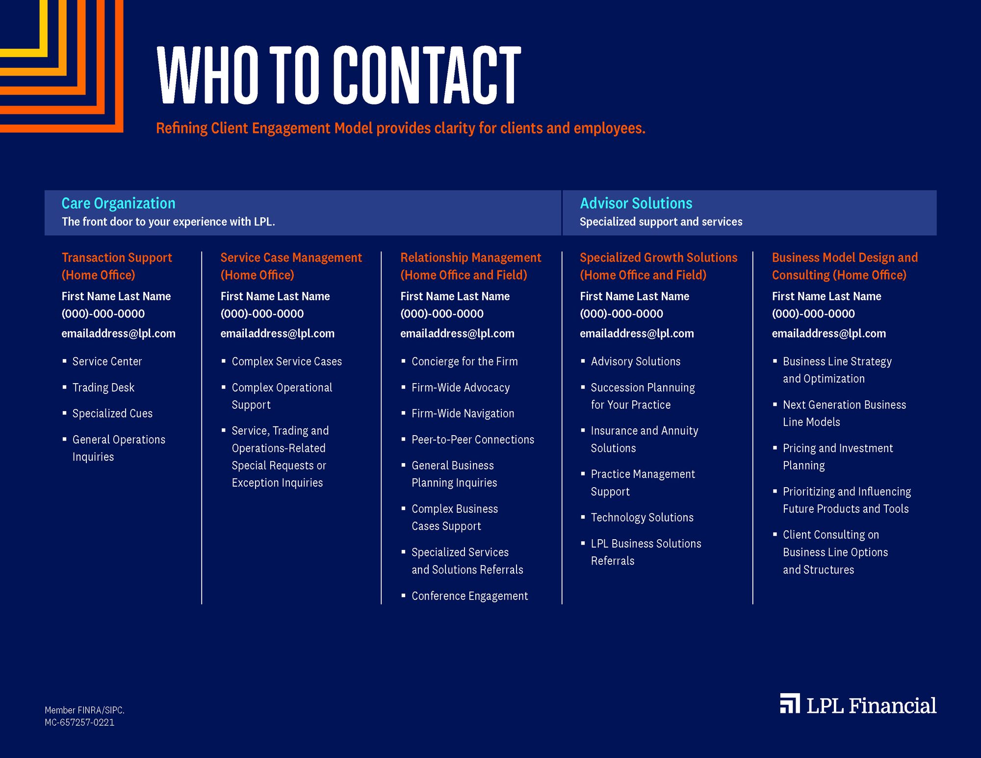
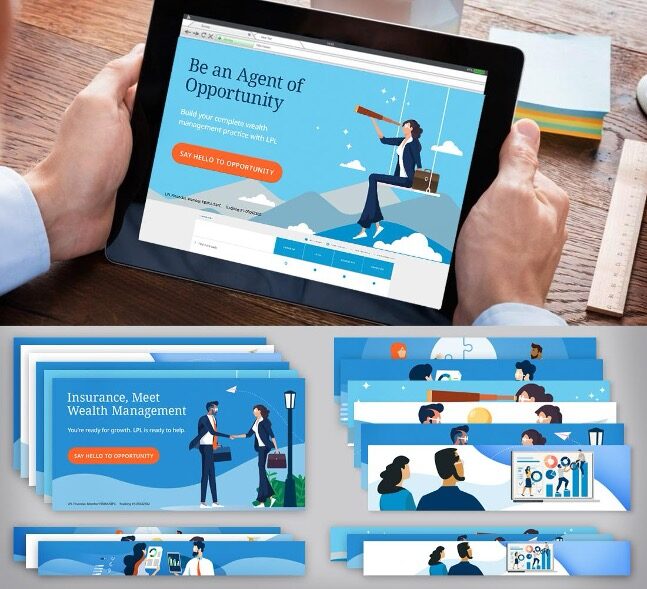
One system, many channels
Bold condensed type, flat illustration and the new orange gave each content series its own face while keeping them in one family.





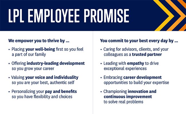
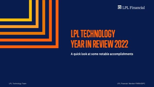
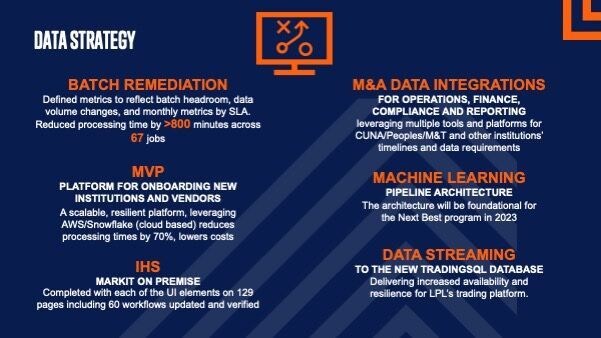
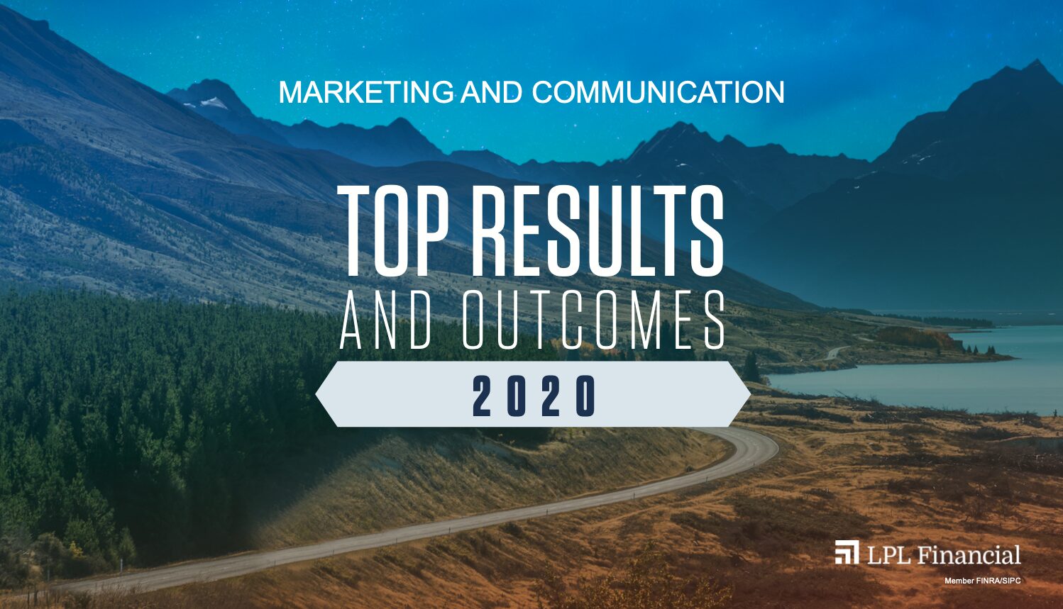
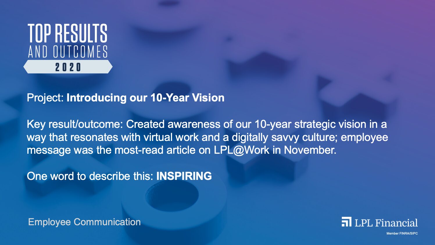
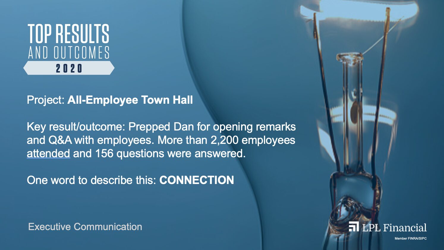
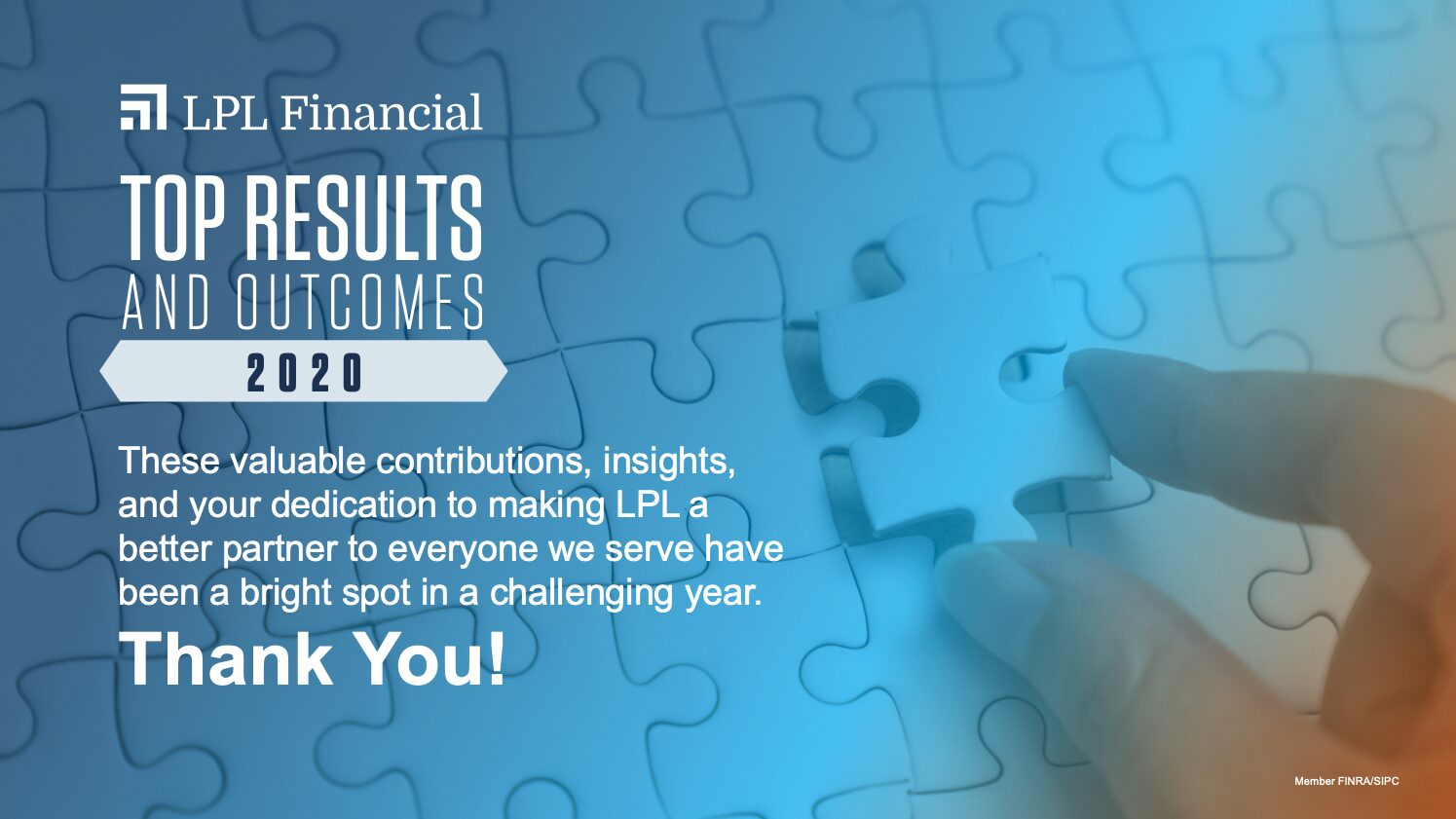
Top Results and Outcomes 2020
I designed this year-end recognition deck for the marketing and communication teams. Each project slide pairs one result with the one word that describes it.
One campaign, many faces
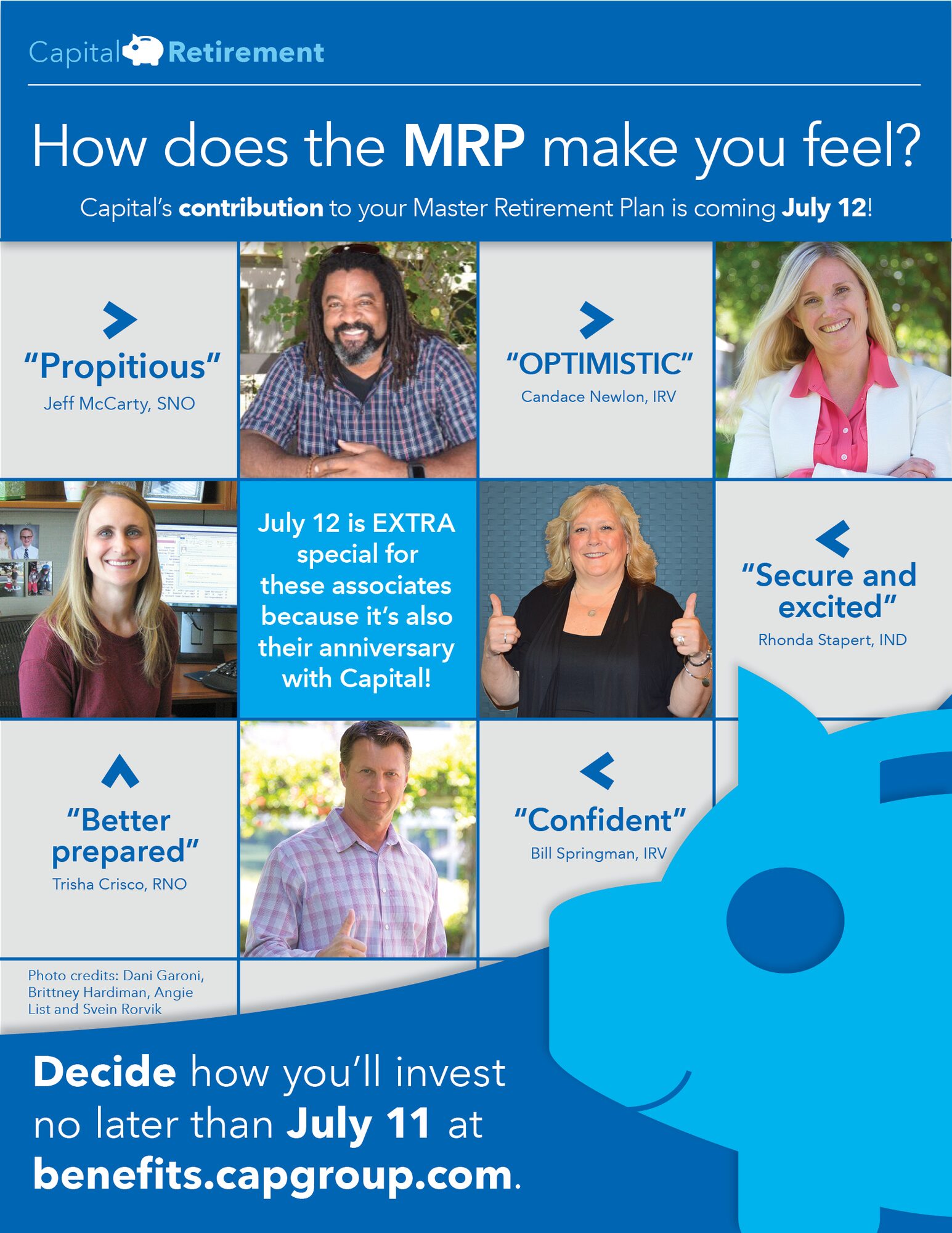
A presentation cover and a set of breakroom flyers built from one bold W, each featuring a Capital Group associate.




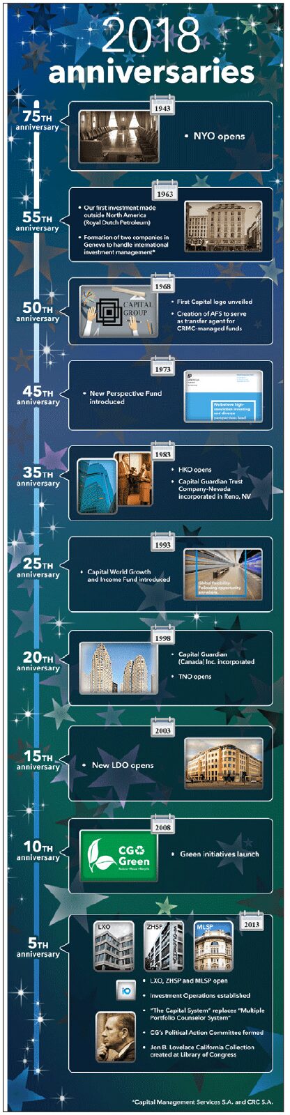
Giving, community and culture
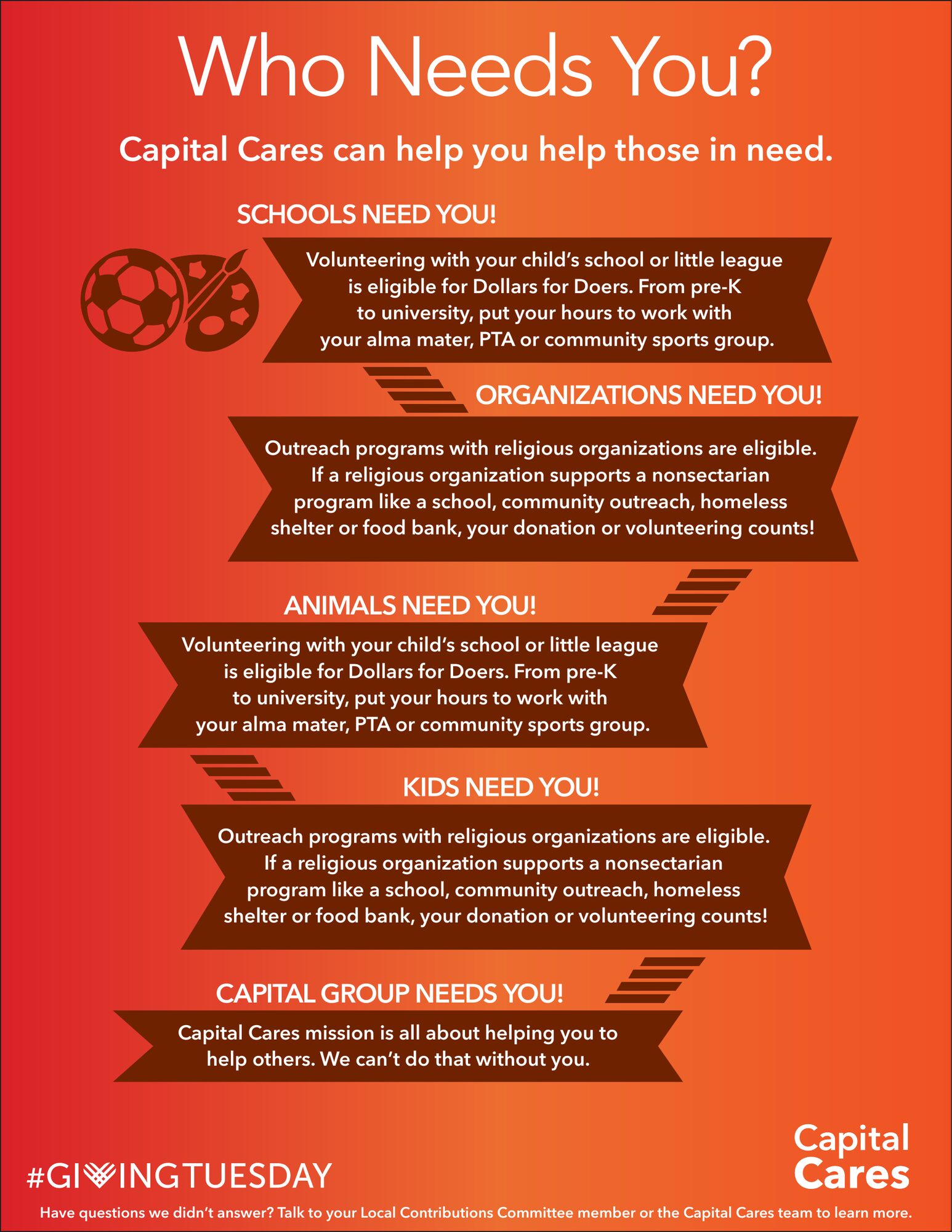
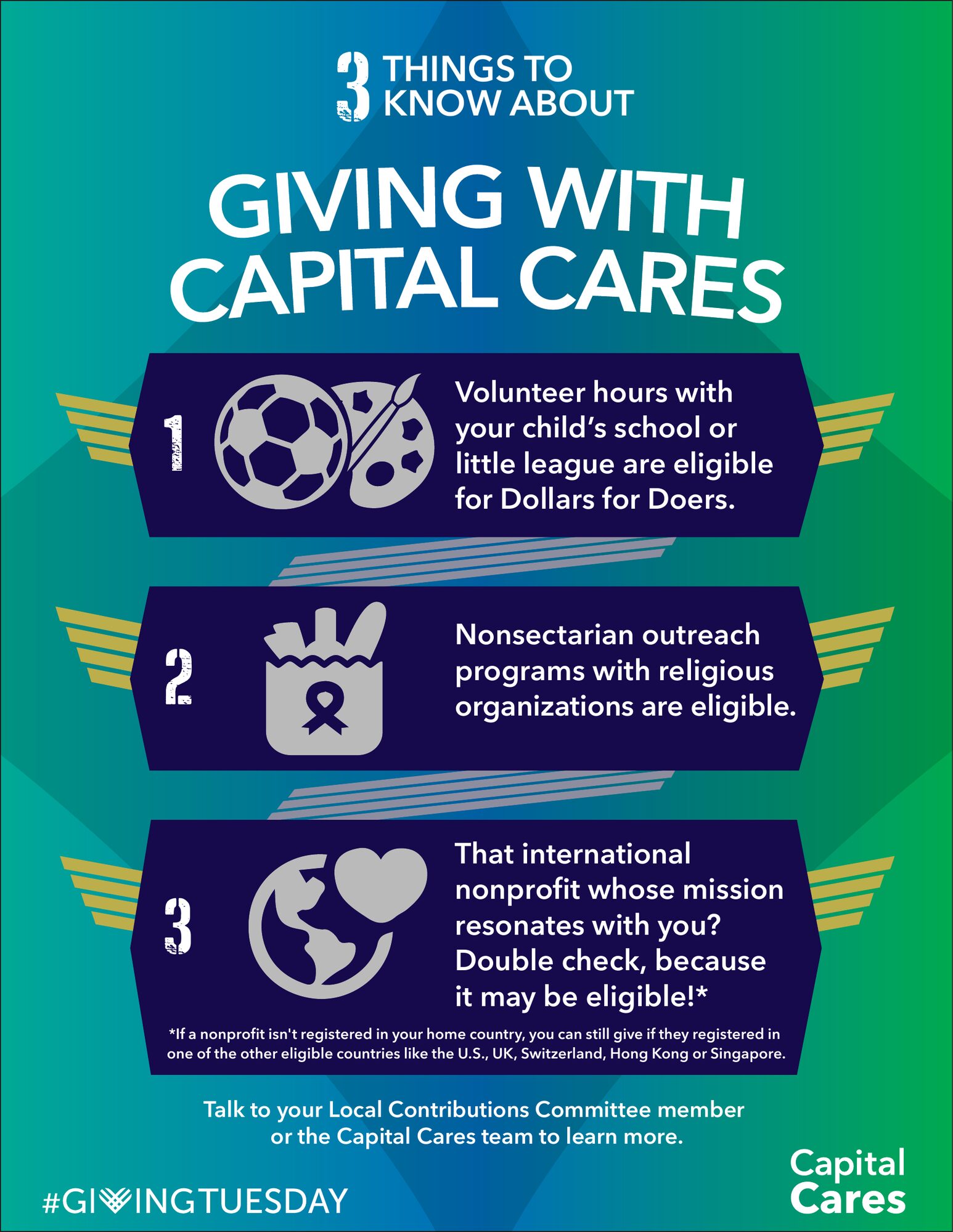
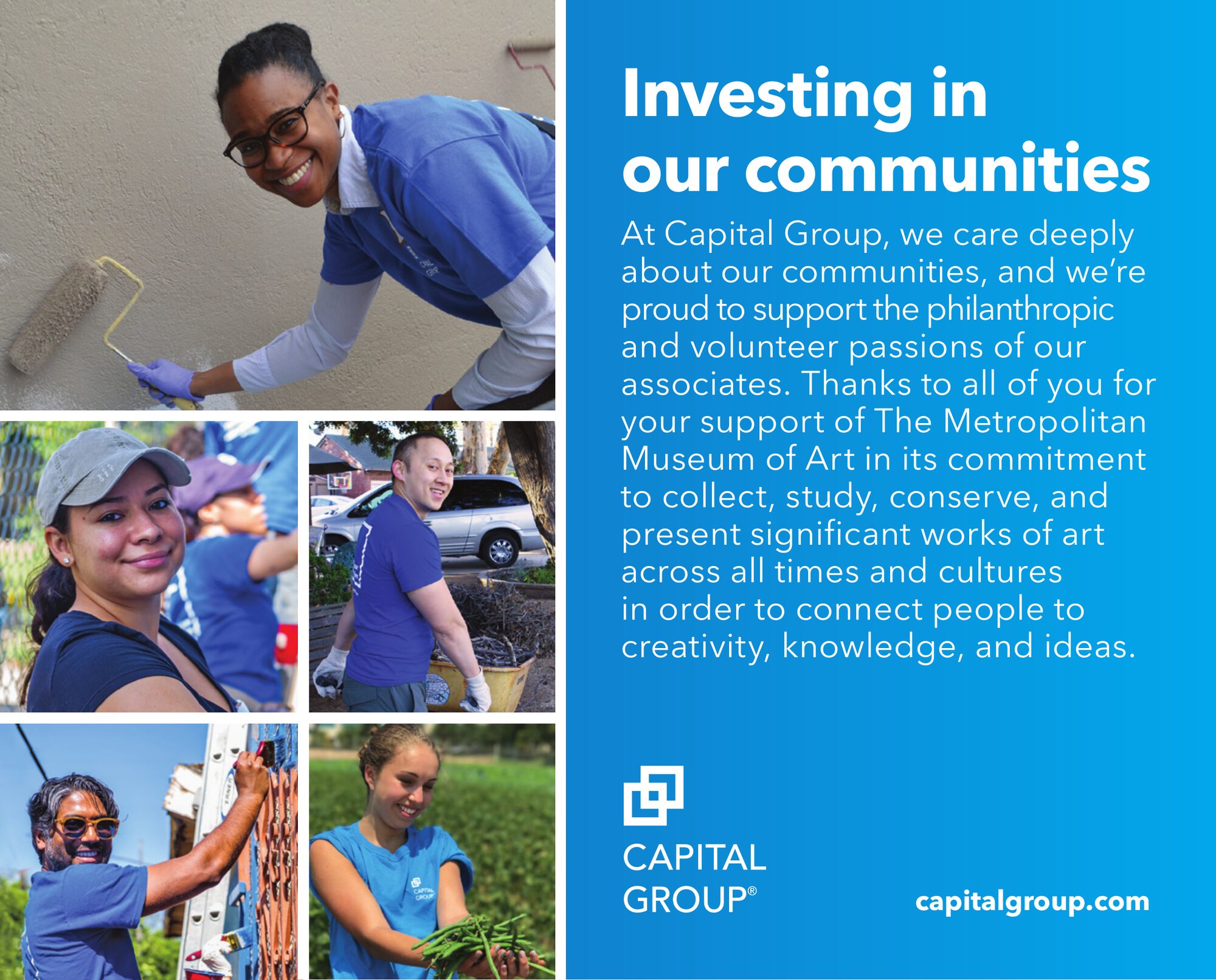
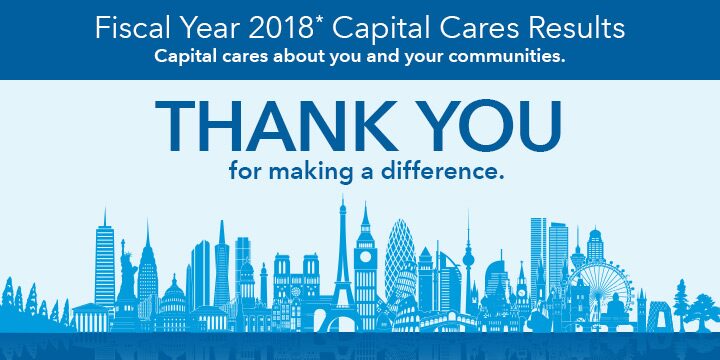
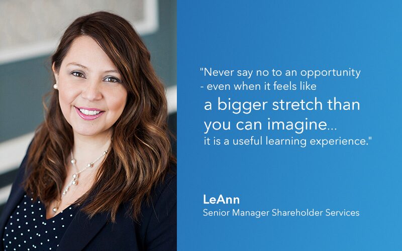
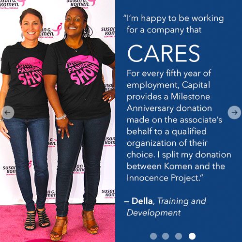
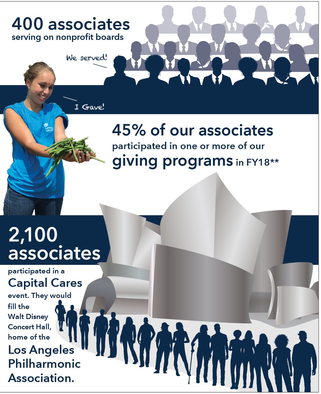
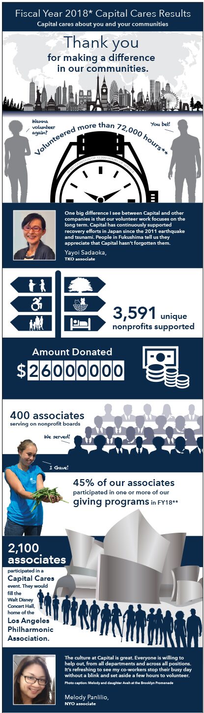
Campaigns for Capital Cares, the associate giving program, plus community sponsorships and culture pieces for the intranet, email and social channels.


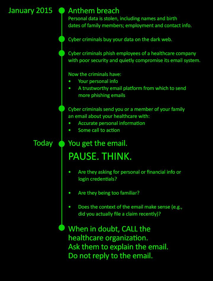

Benefits people actually read
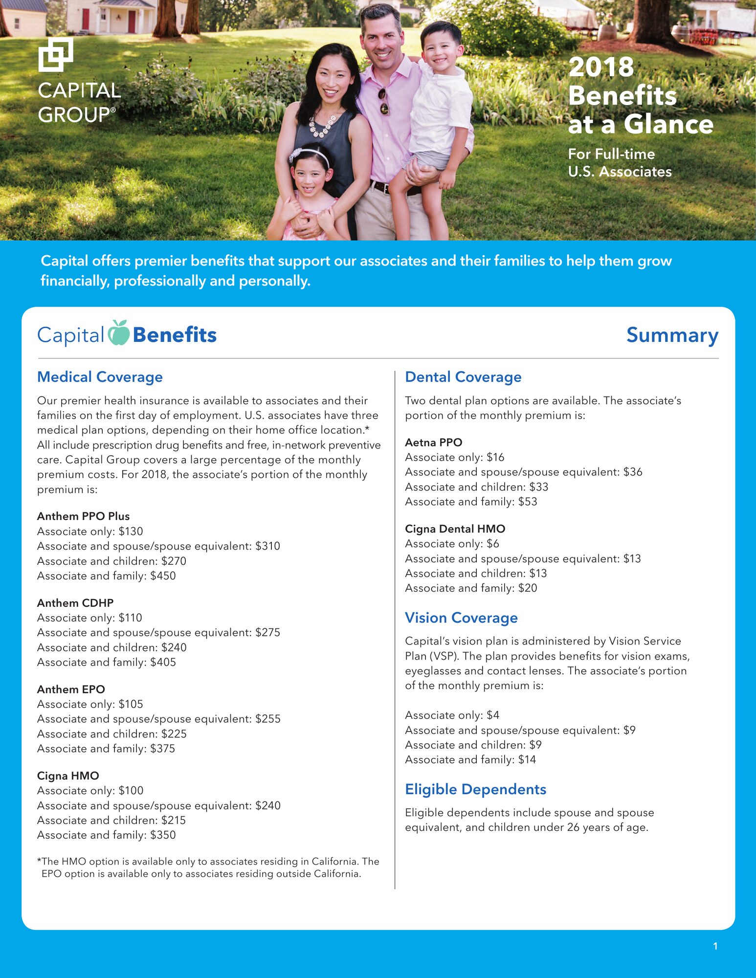
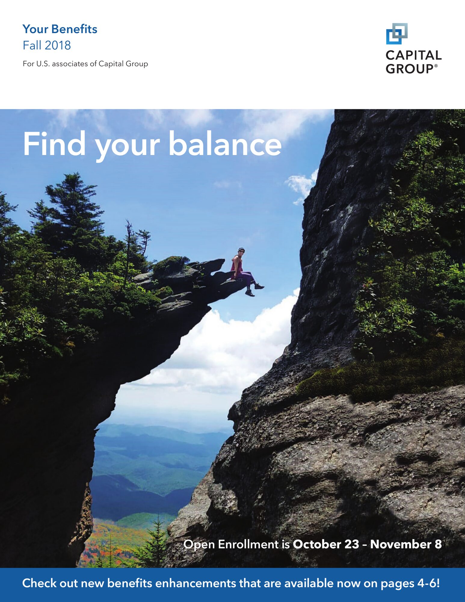
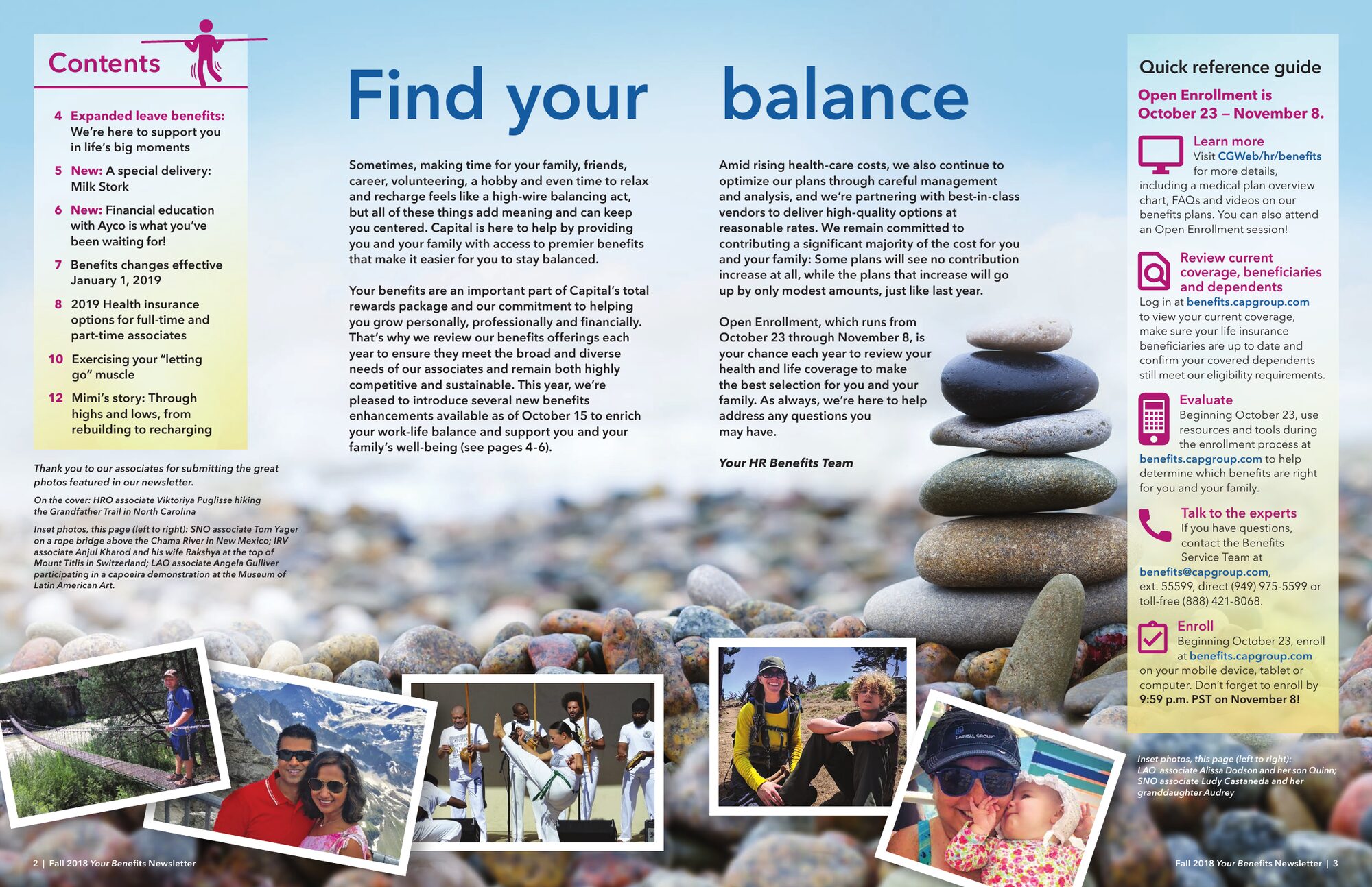
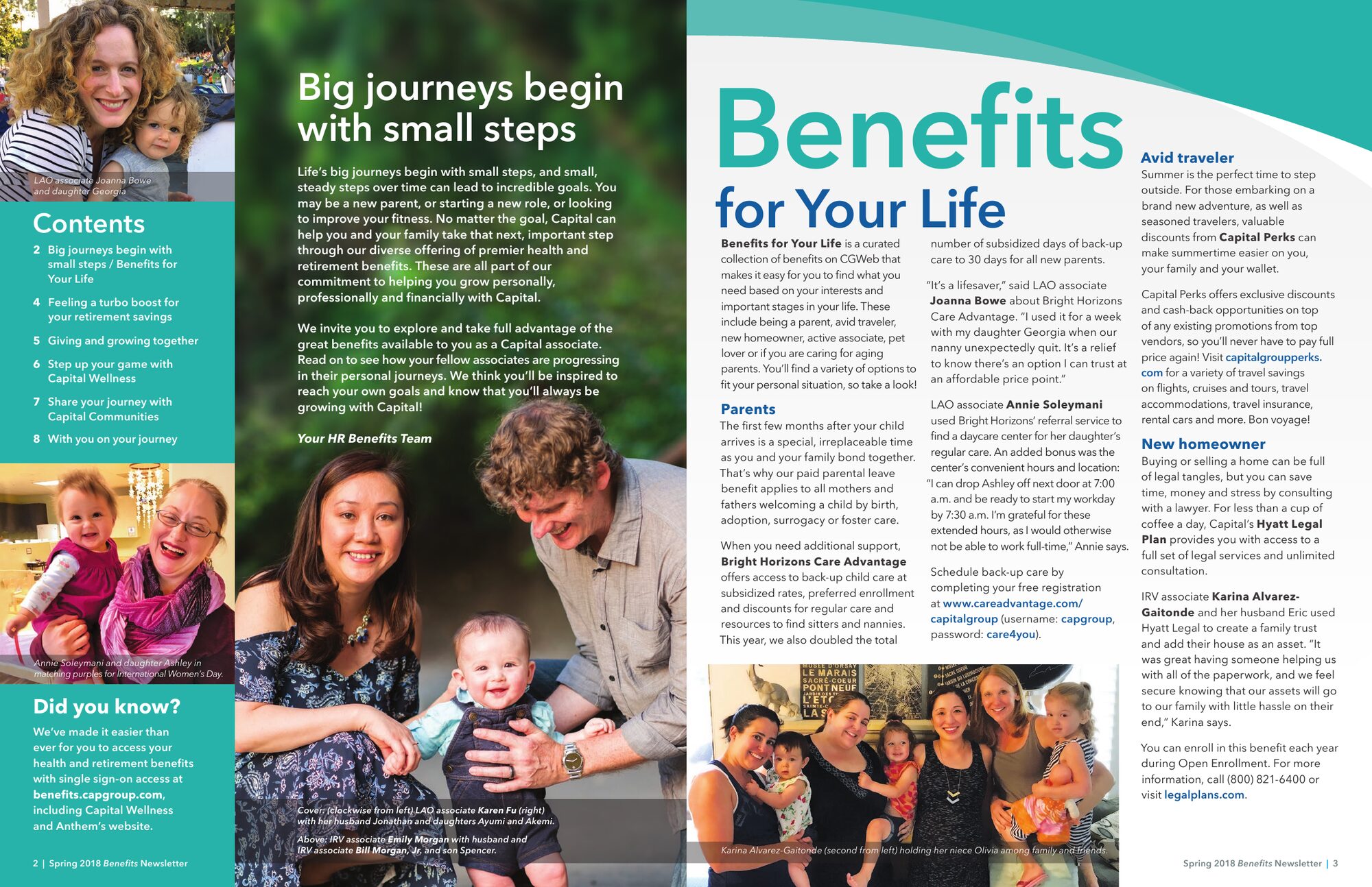
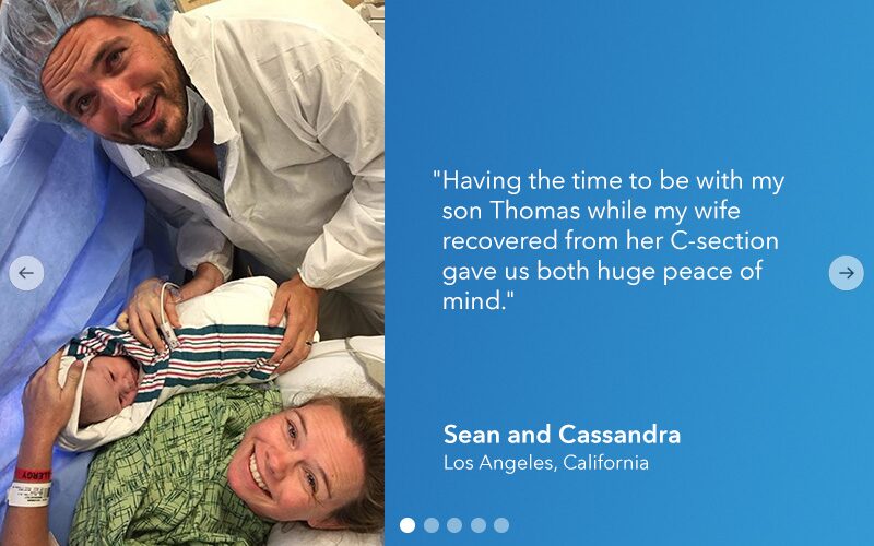
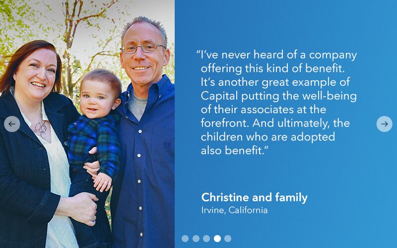
Benefits guides, newsletters and careers site panels that turn plan details into something associates and candidates want to read.


Numbers with a point of view
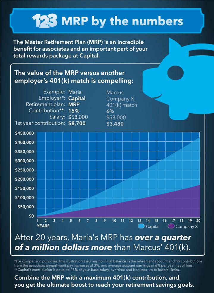
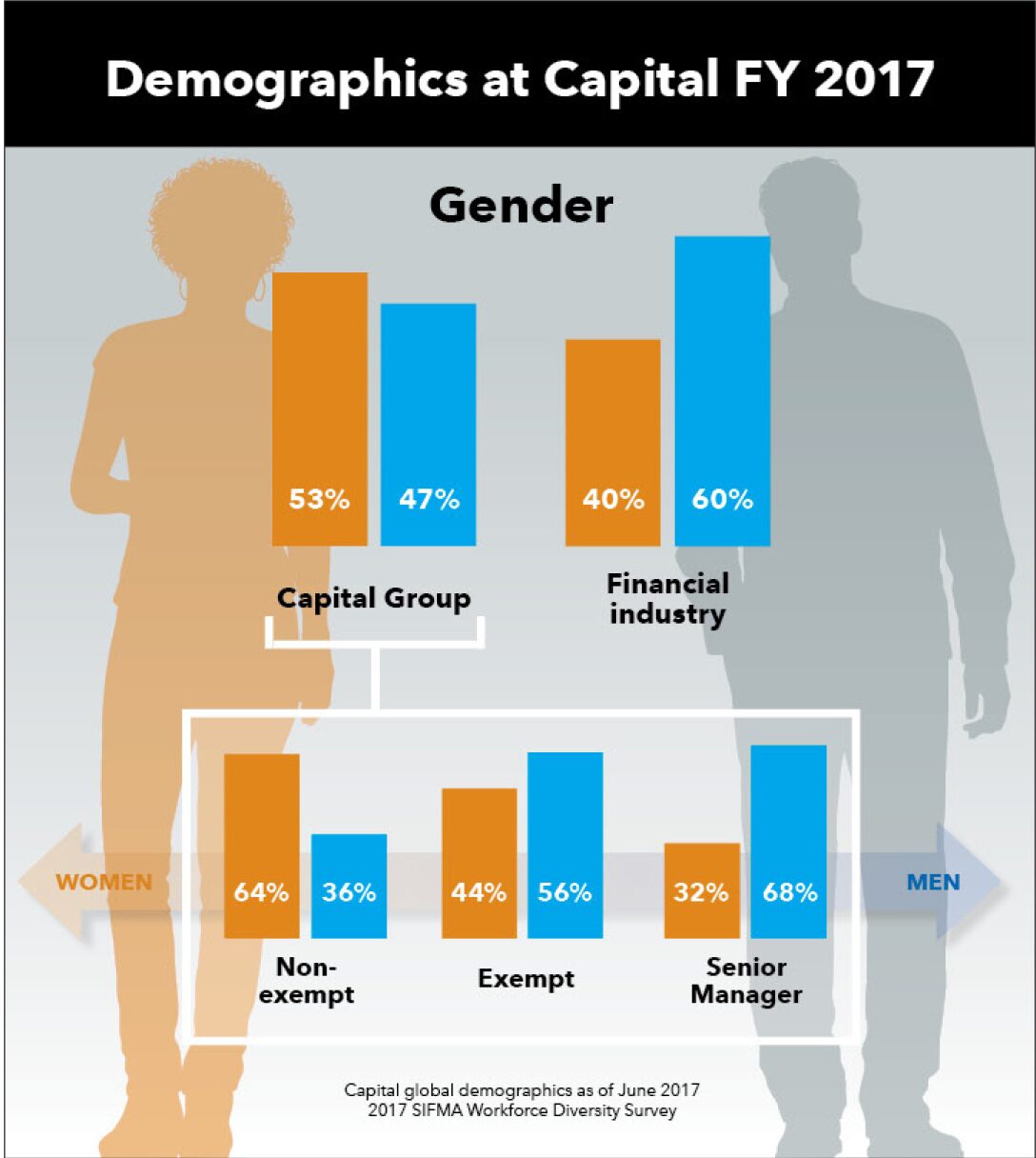
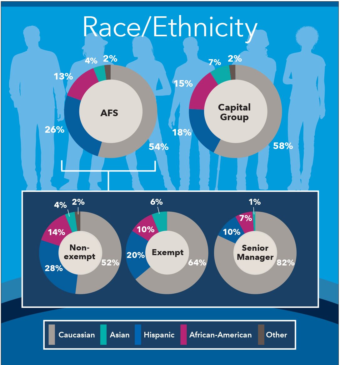
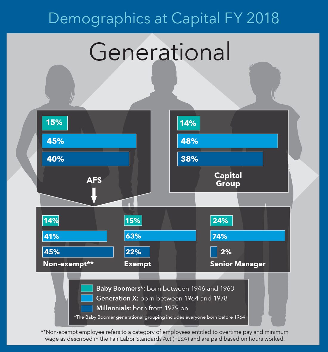
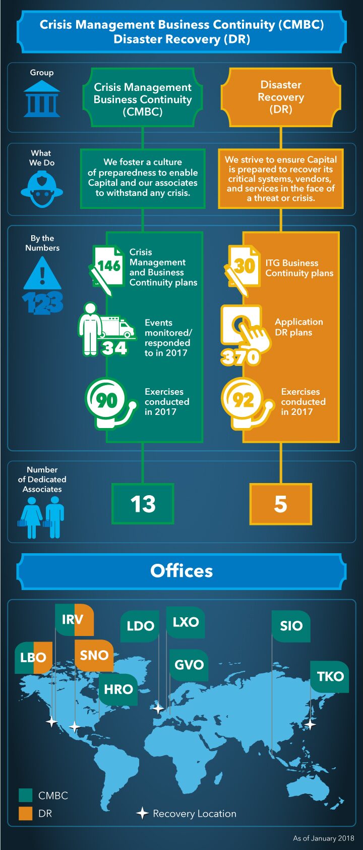
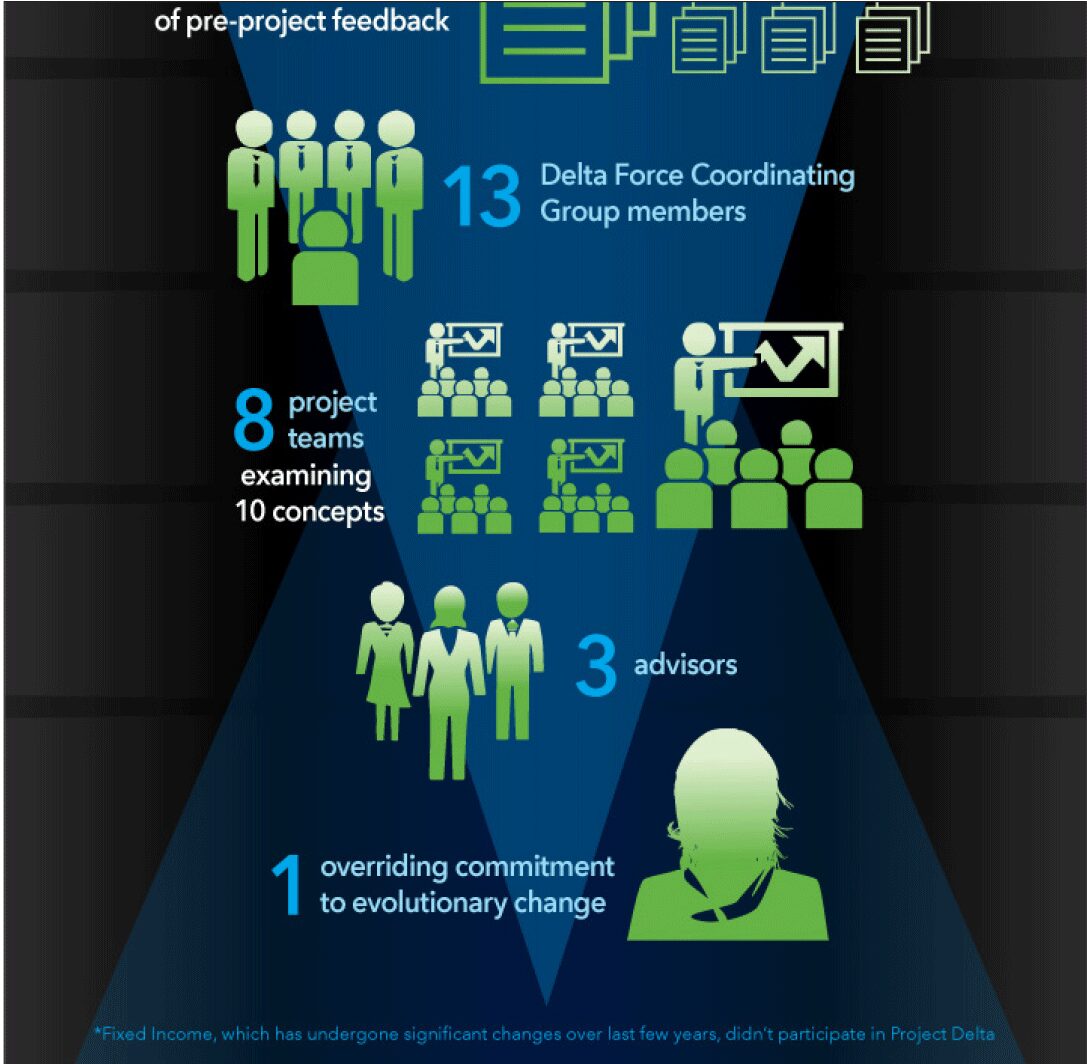
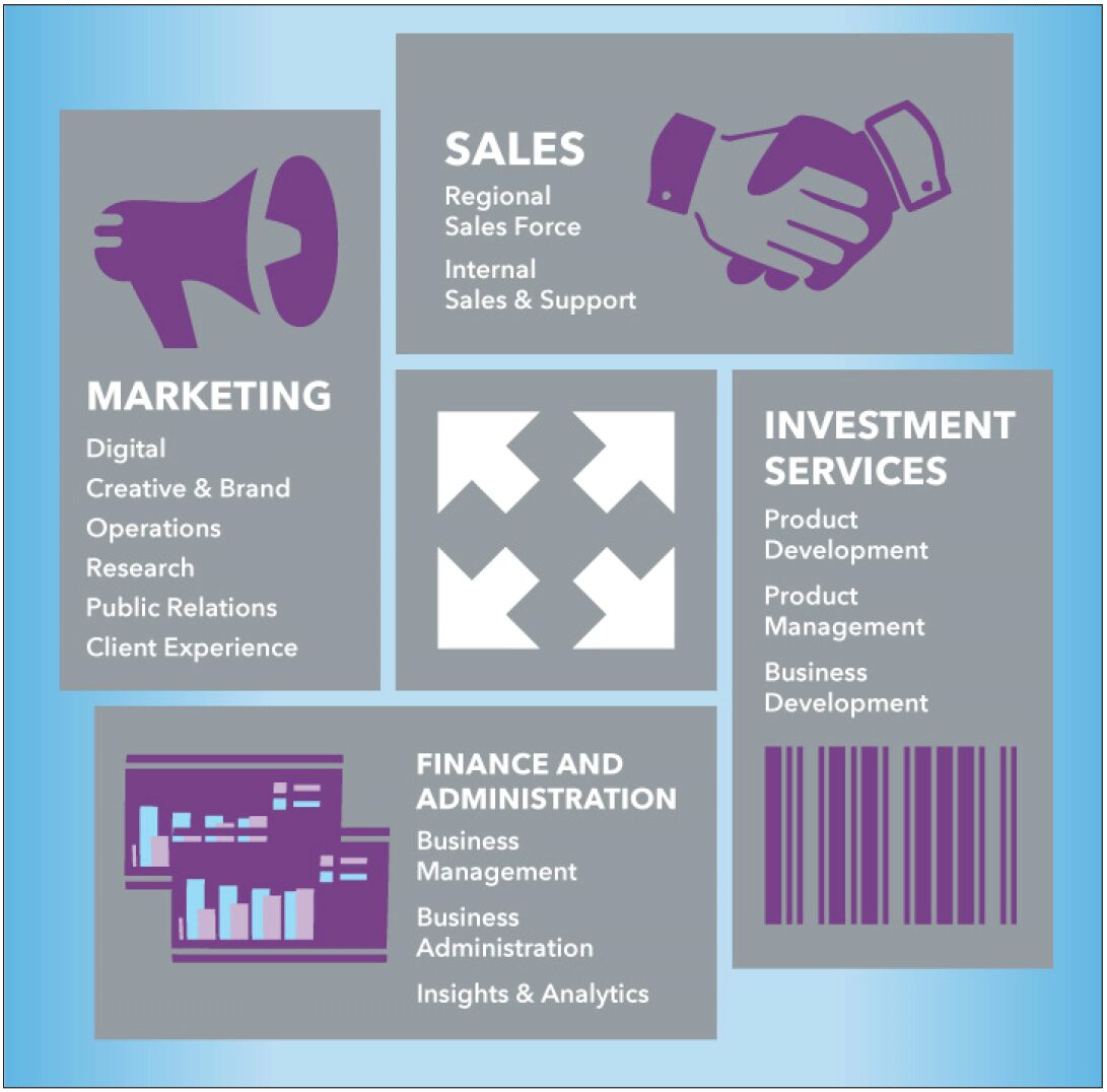
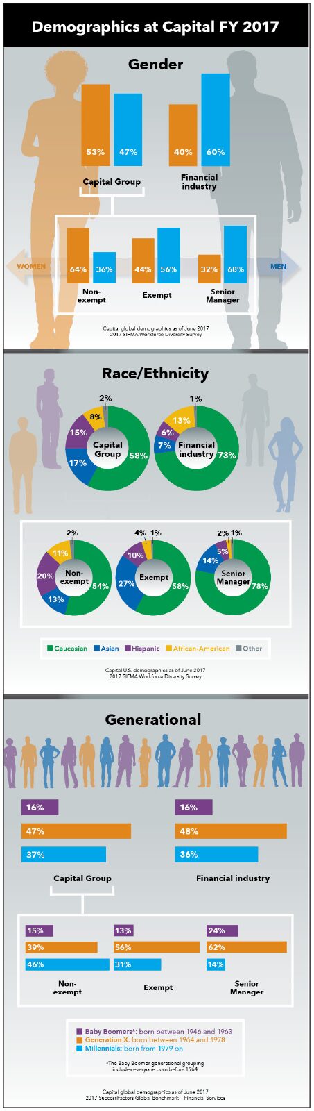
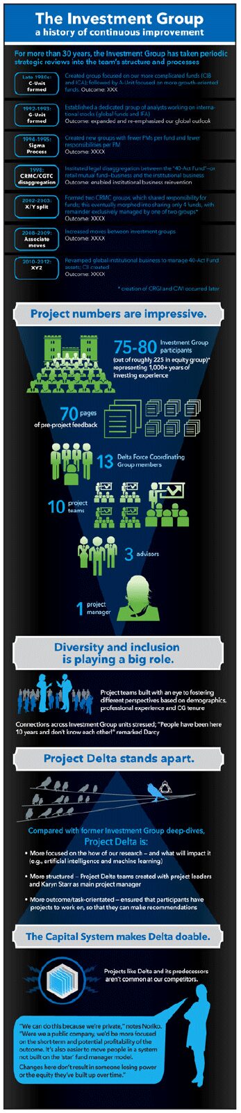
Workforce demographics, giving results and org structures, drawn so the headline number reads first.
Stories and standards